Photography Composition: The Complete Guide (With Examples)
 by Marco Carotenuto · · 13 min read

You’ve read ten lists of photography composition rules, and standing in front of a real scene you still don’t know where to start. That’s because lists tell you what exists (thirds, leading lines, symmetry, frames) but not in what order to decide. So you try everything at once, or nothing.
This guide gives you a five-decision method to run in the same order every time, a table that matches each flaw to the technique that fixes it, the cases where breaking the rules is the right call, and a thirty-second check for any shot. Each technique has its own deep-dive article: here you get the map.
What is composition in photography?
It’s how you arrange the elements inside the frame to decide where the viewer looks. It covers what you include and leave out, where the edges fall, how weight is spread across the picture, and which lines and layers you use. Moving changes all of it: a step sideways, a bent knee or a different lens transforms the same scene.
Photography Life boils it down to simple elements (points, lines, shapes) that, arranged well, reinforce each other. It isn’t a finishing touch you add later: it’s the decision that separates a photo read in two seconds from one that feels “a bit random”, even when focus and exposure are perfect. Of the six criteria for judging a photo, it’s one of the most immediate: viewers feel it even without a name for it.
Do composition rules actually work?
Yes, as shortcuts, not obligations. A rule like the rule of thirds sums up a decision that’s usually worth making: don’t put the subject in the middle out of habit. It works because it forces you to choose, not because the grid has magic powers.
Even the careful sources say so. For Photography Life the secret is to pick your composition on purpose instead of applying the same template to most of your photos. Adobe points out that the elements of composition aren’t algorithms: they guide your decisions, they don’t replace them. PetaPixel opens its list of 28 techniques with the same warning: guidelines, not unbreakable rules.
That’s the idea behind this guide. Instead of memorizing fifteen rules, you learn five questions. The classic rules become the answer to one of them.
In what order should you decide a photo’s composition?
In five steps, always the same: subject, subtraction, weight, path, frame. Order matters because each decision depends on the previous one: you can’t balance the weight of a scene if you don’t know what the subject is, and you can’t guide the eye while elements are still pulling it out of the frame.
The method is our own working proposal, built on the sources cited here: it’s not a standard. Treat it as a checklist.
| # | Decision | The question | Techniques that answer it |
|---|---|---|---|
| 1 | Subject | What is the one thing I want people to look at? | One sentence, distance, viewpoint |
| 2 | Subtraction | What do I remove or leave out? | Negative space, clean edges, simple background |
| 3 | Weight | Where does the scene feel heavy, and how do I balance it? | Thirds, balance, symmetry, horizon |
| 4 | Path | Where does the eye enter, and where does it stop? | Leading lines, foreground, layers, natural frames |
| 5 | Frame | Which rectangle tells all this best? | Vertical or horizontal, crop, thumbnail check |
Let’s take them one at a time.
1. What is the subject of the photo?
The subject is what you want people to look at first, and you should be able to say it in one sentence. “The lone larch in the fog” is a subject. “A pretty valley with lots going on” isn’t: that’s five photos in one.
A practical trick: say the sentence out loud before you shoot. If it contains more than one “and”, you’re trying to fit two subjects into one frame, and one of them has to give way. If the sentence won’t come, the scene doesn’t have a lead yet: change position, light or distance before you touch the composition.
The subject also sets your distance. Moving closer fills the frame and removes what doesn’t matter; stepping back includes the context that gives scale. Neither is right in absolute terms: it depends on the sentence. For a small subject in a big environment, read negative space in photography.
2. What do I remove from the frame?
Everything that doesn’t support the subject sentence. The second decision is subtraction: through the viewfinder your eye filters out what it doesn’t care about, but a photo filters nothing, and a cable, a bin or a bright branch stays in it for good. Photography Life gives this its own section, simplicity: remove the elements that don’t belong to the message of the photo.
The quickest way is the edge sweep: before you shoot, run your eyes along the four sides and four corners of the screen. You’re looking for three things: bright or saturated elements touching the edge, lines running out of the frame, and objects cut in half. Those are the places where the eye escapes.
 Illustrative example, generated: the jetty and the sun work, but the pale branch at upper right and the orange buoy cut off at the bottom (circled in yellow) pull the eye toward the edge. This is a generated image, not a photo of a real place.
The scene here is lovely and the fix is small: two steps to the left, or a branch moved by hand, takes the branch out, and a slightly higher framing leaves the buoy out. No new technique needed, just a look at the edges.
When you remove a lot, you’re often left with an empty area: if it’s calm and sits where the eye should go, it works for you. How to tell living emptiness from dead emptiness is covered in the negative space article linked above.
3. How do I balance the weight of the scene?
By giving more weight to a side that has little, or by accepting that the scene is lopsided on purpose. Visual weight is how strongly a part of the image pulls the eye, and it doesn’t depend on size alone.
According to Photography Life, the strongest pullers are bright objects, saturated colors, high contrast, people and animals, eyes, and unusual elements. A small orange patch can weigh as much as a big dark boulder: that’s why a small, vivid subject can balance a huge, dull mass.
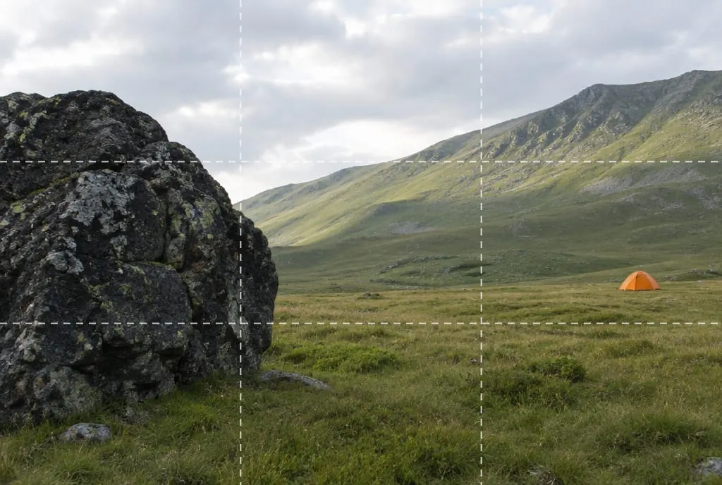 Illustrative example, generated: the boulder is big but dark and dull, the tent is tiny but orange against green. They weigh differently, yet the picture holds together. This is a generated image, not a photo of a real place.
Balance isn’t symmetry. Adobe stresses it: a balanced image doesn’t have to look the same left and right, but its parts complement each other. There are three ways to think it through:
- Counterweight: a strong element on one side, a smaller but vivid one on the other (the boulder and the tent).
- Put the subject on a third line and use the space in front of it as the counterweight. The rule of thirds is the most common shortcut for this, and it has a three-question test for when not to use it. Its lines sit at one third and two thirds of each side; the golden ratio puts them at roughly 38% and 62%, a difference you will barely notice on screen.
- Choose symmetry when the scene is truly mirrored: a sharp lake reflection, a head-on building. There the weight is equal by construction.
The horizon is a special case, since it splits the scene into two weights: where to put it is the subject of the article on horizon placement, with its two-crop test. And if the subject looks or moves somewhere, leave more room in front than behind, a tip you’ll also find in Nikon School’s guide (in Italian).
4. How do I guide the eye through the photo?
By giving it an entry point, a route and an arrival point. The fourth decision is the most visual one: once you’ve chosen the subject, removed distractions and balanced the weights, you organize the eye’s journey through the layers.
The three main tools:
- Leading lines: roads, paths, fences, shadows, shorelines. They only work if they end somewhere worth reaching. There are six types, and the three-check arrival test is in the article on leading lines in photography.
- Foreground: a nearby element that shares color or shape with the scene acts as an entry point. If covering it changes nothing, it’s filler: the guide to foreground interest in landscapes shows how to pick one.
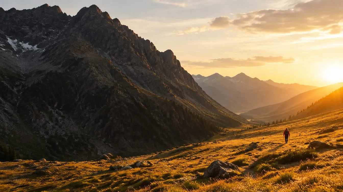
- Overlapping layers: foreground, middle ground and background, as in this article’s cover. A photo turns a three-dimensional world into a two-dimensional image, and overlapping layers put volume back. If your photo feels two-dimensional, the problem is often here: why your photos look flat.
A fourth resource, less obvious, is natural frames: branches, arches, windows, rocks that surround the subject and isolate it. They work like leading lines (they tell you where to look) but in a closed way: if the frame is more interesting than what’s inside, the subject gets lost.
The typical mistake at this stage is stacking tools: a line, a foreground and a frame all at once is too much. In a good landscape one strong tool and a second in support is often enough.
5. Which frame do I choose: vertical, horizontal, crop?
The one that keeps what matters inside and the rest out. The last decision is about the rectangle itself: orientation, aspect ratio, viewpoint and, if needed, the final crop.
- Horizontal or vertical: ask which way the subject extends. A waterfall, a tree or a door extend upward; a wide valley or a long horizon extends sideways. If you’re unsure, shoot both: it costs ten seconds.
- Viewpoint: going low or high changes the relationships between layers without changing the scene. Adobe collects advice from two photographers: move around, get very low or very high, get close or step back until the frame works.
- Crop: it can fix a horizon or remove a distraction, but it costs resolution and can’t add what you didn’t capture. Better to frame slightly wide and crop little. Adobe also suggests rotating or flipping the image while you crop, to see something different. In our view the reason is simple: upside down, a photo reads as masses and lines, not as a subject.
Which technique should I use for which problem?
Start from the symptom, not the rule: look at the photo, name what’s wrong and go to the matching row. The table links the most common flaws to the decision and to the article with the deep dive.
| What you see | Decision | Try first | Deep dive |
|---|---|---|---|
| I don’t know what to look at | 1 Subject | The one-line sentence; move closer | How to evaluate a photo |
| The eye slides toward an edge | 2 Subtraction | Edge sweep; move or crop | Negative space |
| The photo feels “stuck” or split in two | 3 Weight | Put the subject on a third; horizon high or low | Horizon, Rule of thirds |
| No depth | 4 Path | Add a foreground, get lower | Flat photos, Foreground |
| The eye enters but never arrives | 4 Path | Close the line on the subject | Leading lines |
| The photo is confusing at first glance | 5 Frame | Orientation, crop, thumbnail | Photo critique |
When should you break the rules?
When the break has a reason and you can state it in one line. Within the five decisions, a rule is only broken if the break serves the subject sentence. Four typical cases:
- Subject in the center: it works when it fills the frame, when the scene is symmetrical, or when you want a static, head-on image.
- Horizon in the middle: it holds up with a sharp reflection, where sky and water weigh the same.
- A scene unbalanced on purpose: a small subject in a corner, the rest empty, to convey isolation or scale. Photography Life notes that a balanced and an unbalanced image convey different emotions, and neither is better in the abstract.
- Controlled chaos: a dense scene where the accumulation is the point of the shot.
The line between breaking and forgetting is thin. If you can’t explain why you put the subject where you did, you didn’t break the rule: you ignored it.
How do I check a composition in 30 seconds?
With four checks, in the order the eye reads a photo. You can run them on the screen before you shoot or on the computer afterwards.
| Check | How | If it fails |
|---|---|---|
| Thumbnail | Shrink the photo to a stamp or squint at the screen | If it turns into a blob, revisit the weights (decision 3) |
| Sentence | Say what you want to show in one line | If it won’t come out, revisit the subject (decision 1) |
| Edges | Run along the four sides and corners | If something touches or exits, revisit subtraction (decision 2) |
| Flip | Turn the photo upside down | If you find an empty or heavy side, revisit path and frame (decisions 4 and 5) |
The most useful check is the thumbnail, because it strips the detail and leaves the masses. The same test, applied to composition, is in our guide to the criteria for judging a photo.
How does Framia score it?
Composition is one of Framia’s six categories, alongside light, optics, color, story and technique. It gets a score from 0 to 100 with a concrete explanation, on the same scale as all the others: between 55 and 69 the intent shows but the execution has clear limits, from 80 up the shot is strong with no significant flaws. A composition problem isn’t made up for by good focus, which is why it pays to look at the lowest category rather than the average. If you want to know what an automatic analysis can and can’t do, there’s an article for that: AI photo analysis.
What to do next
A thirty-minute exercise with any scene you like, even near home, to train the five decisions one at a time.
- Pick one spot and write the subject sentence in one line.
- Take a baseline shot, the way you normally would.
- Redo the scene changing only one decision at a time, in this order: move closer or farther (1), do the edge sweep and remove one distraction (2), shift the subject by a third (3), add or remove a foreground or a line (4), try the vertical version (5).
- Put the six shots side by side as thumbnails and don’t look at the details.
- For each, say out loud where the eye goes first and where it stops.
- Pick the best one and write a line: which decision made the biggest difference. That’s your weak habit, the one to train on your next outings.
If you want a second opinion, upload the chosen shot to Framia and read the composition score with its explanation: it tells you whether the choice holds up and where the eye gets lost.
FAQ
Do you always have to follow the rules of composition?
No. They are shortcuts that work most of the time, not laws. A centered subject, a horizon in the middle or a deliberately busy scene can all be right if you have a reason. The problem is the shot where you chose nothing.
What is the most important composition rule?
Knowing what the subject is. If you can't say it in one sentence, no grid, line or frame can save the photo, because there is nothing to organize the picture around.
Can you learn composition on your own?
Yes, but you need a method: pick one scene, change one decision at a time and compare the shots as thumbnails. A hundred unrelated photos you never compare teach far less than ten variations of the same scene.
Are composition and framing the same thing?
Framing is the rectangle you choose: where the edges fall, vertical or horizontal. Composition includes framing, but also everything inside it and how you arrange it: weight, lines, layers.
Can you fix composition afterwards by cropping?
Partly. A crop moves the edges and can fix a tilted horizon or remove a distraction, but it costs pixels and can't add what you didn't capture. That's why it pays to frame slightly wide and crop only what you need.
Do landscape and portrait photography use different composition rules?
The principles are the same: a clear subject, clean edges, balanced weight. The tools differ. In landscapes you work with layers, the horizon and foregrounds; in portraits with gaze, space in front of the face and the background.