Visual Weight in Photography: Why a Photo Feels Unbalanced
 by Marco Carotenuto · · 8 min read

You look at a photo and you like it, but something is off: it seems to slide to one side. The light is good and the subject is strong, yet the image does not stand up. Very often the cause is visual weight.
Here you will learn what it is, which factors decide it, a three-step test to find the heaviest spot in your own photo, and four ways to rebalance it. At the end there is an exercise to run on your own images.
What is visual weight in photography?
Visual weight is how strongly an element pulls the viewer’s eye. It is not physical weight and it is not the same as size: it measures how much an element “tugs” at the gaze compared with everything else in the frame.
It matters because the eye does not land at random. It goes to the heaviest element first and then moves on. If one element dominates, the eye stays there and the rest of the frame turns into background. If two or three are well spread out, the eye travels through the image and the photo feels balanced.
Here is the worst case: all the weight sits on the left.
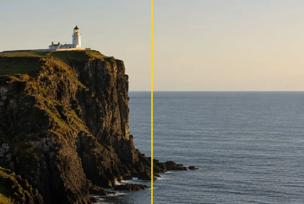 Image generated to illustrate the concept: the yellow line marks the center. Cliff, lighthouse and bright sky are all on the left; the right is plain sea. The photo leans to one side.
What makes an element heavy?
An element gets heavier when it stands apart from its surroundings in size, tone, color, sharpness or isolation. What counts is how much it differs from what is around it, not its absolute value.
| Factor | It weighs more when… | Example |
|---|---|---|
| Size | it fills more of the frame | A mountain next to a boulder |
| Contrast | it is much lighter or darker than its surroundings | A white building on a dark cliff |
| Color | it is saturated, or a different hue from the rest of the scene | An orange boat on a gray-blue lake |
| Sharpness | it is in focus while the background is blurred | A sharp flower in an out-of-focus meadow |
| Isolation | it stands alone with free space around it | A lone tree in a field |
| People and gaze | it is a person or animal, especially with visible eyes | A figure, even a tiny one, in a landscape |
| Position | it is far from the center: the farther, the heavier | A subject near the edge of the frame |
On position, the sources disagree: some say an element weighs more near the top of the frame, others near the bottom. Treat it as a weak factor and, when in doubt, trust the test further down.
Gaze matters too. If a person is in the frame, viewers tend to follow the line of their eyes, so the space they look toward gains weight, as Photography Mad explains.
Is dark or light heavier?
Whatever contrasts most with its surroundings is heavier. On this the sources contradict each other: Photography Mad says darker items carry more weight than lighter ones, while the Italian blog Fotografare per Stupire argues the opposite.
Both are right, depending on the scene. A small light element on a dark area draws the eye because it is an island of light. A dark block against a bright sky draws it because it is a solid mass. In practice tone alone does not decide; the difference does. When you look at your photo, do not ask “is it dark or light?” but “what stands out most from its surroundings?”
How do I find the heaviest spot? The three-step squint test
To find the heaviest spot, run the three-step test: squint, mark, measure. It takes a minute and needs no tools.
- Squint. Look at the photo with your eyes almost closed, or shrink it to a thumbnail. Fine detail disappears and only a few patches of tone and color remain.
- Mark. Pick out the two or three strongest patches and rank them from heaviest to lightest.
- Measure. Imagine a vertical line down the middle. Are the patches spread across both sides, or all on the same one? The farther a patch sits from the line, the more it counts.
Here is the same method on a balanced photo: a strong blur leaves two patches, and the circles show where they are.
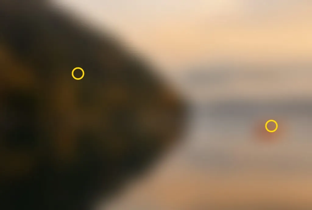 The same lake photo, blurred as if you were squinting. Two patches remain: the dark block on the left and, on the right, a small orange dot that is bright and far from the center.
The test has a limit: it measures tone, color and size, but not fine detail or gaze. After running it, add one check by eye: are there faces, eyes or animals? If so, give them more weight than the patch suggests.
How do you rebalance an unbalanced photo?
You rebalance by adding a counterweight on the light side or by taking weight off the heavy side. The principle is a lever: a large element near the center can be balanced by a small one far from it. PetaPixel explains the same idea with a seesaw.
The four levers, from simplest to most invasive:
| Lever | What you do | When to use it |
|---|---|---|
| Move your viewpoint | Step sideways or change height: distances between elements change | The scene is still in front of you |
| Crop | Trim part of the heavy side, or add room on the light side | The photo is already taken |
| Change the tone | Lighten or darken an area in editing to quiet a dominant element or strengthen a weak one | The element has the wrong tone, not the wrong position |
| Add or remove an element | Wait for a counterweight to enter the scene, or leave out whatever weighs too much | The light side is genuinely empty |
Here is an example where the balance already works: the dark hillside fills the whole left half, but a small orange boat, far from the center and alone on the water, makes up for it.
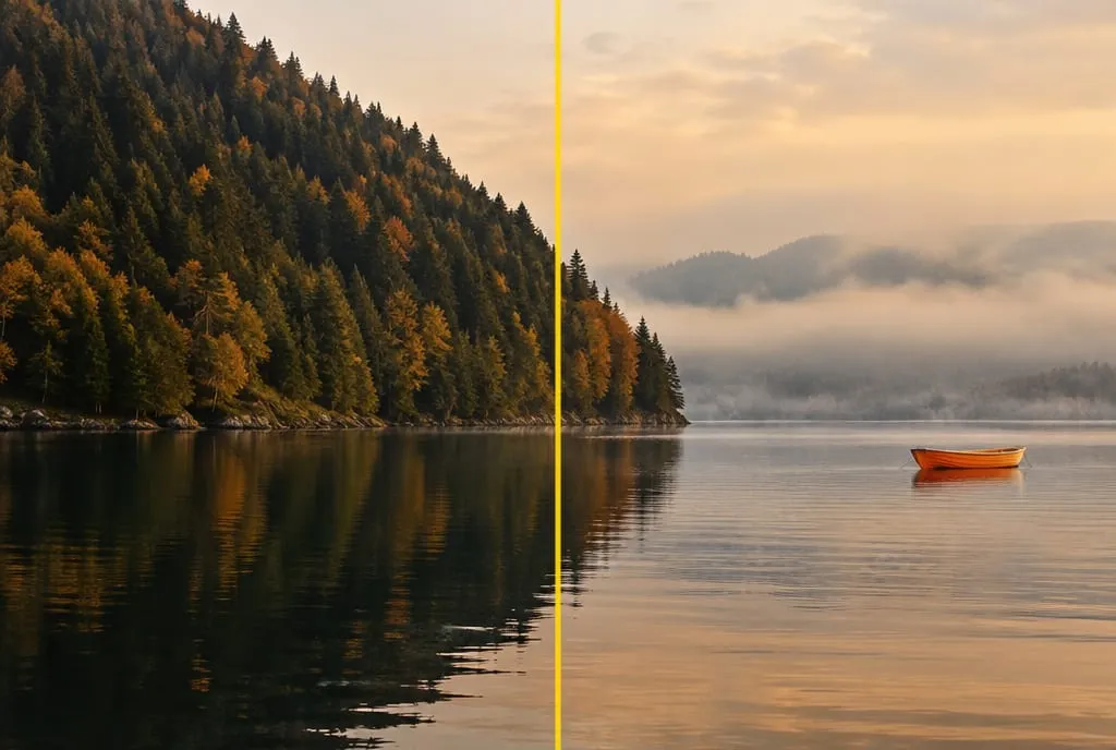 Image generated to illustrate the concept. The left side is much larger and darker, but the boat is saturated, isolated and far from the axis: it weighs enough to balance it.
Without the boat the image would not be wrong, but it would lean left. That is the right way to think about it: a counterweight is not decoration, it is what makes the frame stand up.
Are balance and symmetry the same thing?
No. Symmetry is a special case of balance, achieved with elements that mirror each other. Asymmetrical balance gets the same effect from elements that differ in weight and position, and it is what you deal with in most landscape photos.
To go deeper on the symmetrical case, read symmetry in photography. For where to place subjects against the grid, there is the rule of thirds: the intersection points are handy positions for a counterweight away from the center. For empty space that balances on purpose, see negative space. The big picture is in the complete guide to photography composition.
When is imbalance the right choice?
It is the right choice when you can say what it communicates. Deliberate imbalance conveys tension, solitude or movement. Accidental imbalance only conveys that you did not think about it.
| Intention | What it looks like | Why it works |
|---|---|---|
| Solitude | A small subject on one side, a large void on the other | The void makes distance felt |
| Movement | A subject in motion with space ahead, not behind | The eye follows the direction and “sees” where it is going |
| Tension | A strong element near the edge, little weight on the opposite side | The frame feels about to tip |
| Dominance | One huge dark element, the rest almost empty | Scale overwhelms the viewer |
The test is simple: if you remove the imbalance, does the photo lose its meaning? If so, it was a choice. If nothing changes, it was an accident.
How does Framia score it?
Visual weight feeds mainly into the composition criterion. Well-distributed weight, with a clear subject and a sensible counterweight, works in favor of the score. A photo where the weight leans to one side for no readable reason typically lands in the 55-69 band of the rubric: the intent can be sensed, but the execution has clear limits.
What to do next
A half-hour exercise with ten of your own photos, picked at random from your archive:
- For each one, run the three-step test: squint, mark the two or three strongest patches, measure which way they lean.
- Sort the photos into three groups: balanced, unbalanced on purpose, unbalanced by accident.
- Take the three that are unbalanced by accident and choose one lever for each: crop, tone, viewpoint or counterweight.
- Apply the lever and run the test again. Does the dominant patch weigh less? Is the light side more alive?
- Write one line per photo: what would I have done at the moment of the shot? That sentence is your next rule.
If you want a second opinion, upload your most unbalanced photo to Framia and read the explanation for the composition criterion: it helps you see whether the arrangement of elements is working.
FAQ
Is visual weight the same as the size of an element?
No. Size is only one factor. A small spot that is highly saturated, or much brighter than what surrounds it, can outweigh a large uniform area. That is how a tiny boat can balance an entire hillside.
Does a balanced photo have to be symmetrical?
No. Symmetry is one way to get balance, not the only one. In asymmetrical balance the elements differ in weight and distance from the center, and the scene still holds together: a large element near the center can be balanced by a small one far from it.
How can I tell if my photo is unbalanced without any tools?
View it as a thumbnail or squint at it: only a few patches of tone and color remain. If all the strong patches sit on one side and the other side is plain space, the photo leans that way. Then ask yourself whether that was a choice or an accident.
Do people in a photo always carry more weight?
They almost always draw the eye, especially when you can see their eyes, and the direction they look in gives weight to the space they face. A very small figure seen from behind weighs less than a face, but a bright color can make up for it.
Is an unbalanced photo always a mistake?
No. Imbalance creates tension and can be deliberate, for example for an isolated or moving subject. It becomes a mistake when you cannot say why the weight sits on one side: if there is no reason, it is usually an accident.