Negative Space in Photography: How to Use Emptiness
 by Marco Carotenuto · · 9 min read

A small subject in a big empty frame can be an elegant photo or an unfinished one. The difference isn’t how much emptiness you leave. It’s what that emptiness is doing.
This guide covers what negative space is, three checks that tell you whether yours is live or dead, how to decide how much to leave, and where the subject should sit. It ends with a half-hour exercise you can run on any subject.
What is negative space in photography?
Negative space is the part of the photo that isn’t the subject: sky, water, snow, a wall, a stretch of sand. The subject is the “positive space”, where the eye lands first; everything around it is what lets it be read. Digital Photography School defines it the same way.
Three clarifications clear up the usual confusion:
- It doesn’t have to be blank. A surface with a regular texture (ripples, thin clouds, snow) still counts as negative space as long as it doesn’t pull attention.
- It isn’t a blurred background. Blur is an effect of aperture; negative space is a decision about framing. Photography Life makes the same point, answering a commenter who mixed them up.
- It isn’t the same as minimalism. Minimalism uses plenty of it, but you can have negative space in a photo full of things.
What does empty space do in a photo?
Empty space tells the viewer which element is the subject at a glance, gives it scale and sets the mood. A bird or a boat surrounded by sky or water reads instantly; the same subject among twenty other elements doesn’t.
Four concrete jobs:
- It isolates the subject. With fewer elements, the eye has no alternatives.
- It gives scale. A small figure in a big expanse makes you feel how big the expanse is.
- It slows the eye down. A photo with air around the subject feels calmer than a crowded one.
- It balances. Emptiness has its own visual weight: Photography Life points out that adding or removing it changes how heavy the other elements look in the frame.
How can you tell live negative space from dead?
Run three checks, in order. If you fail two of them, you don’t have negative space, you have an area where you never made a decision. These are our own three questions, designed to help you look at your photo with a cold eye.
| Check | The question | If the answer is no |
|---|---|---|
| Contrast | Does the subject separate from the space by tone (light on dark), color or texture? | Change your viewpoint, wait for different light or pick a stronger subject |
| Quiet | Is the space uniform, with no blotches, poles, stray clouds or other points that catch the eye? | Reframe, crop, or remove the distraction in editing |
| Direction | Does the emptiness sit where the eye needs to go (where the subject is moving, looking or facing)? | Move the subject to the opposite side, or change the framing |
In the example below the subject sits on one side and the emptiness opens on the other: a lone pine at the lower right, with all the space to its left. Strong contrast (dark on light), quiet (uniform sky and snow) and clear direction: the eye enters at the pine and travels into the empty area.
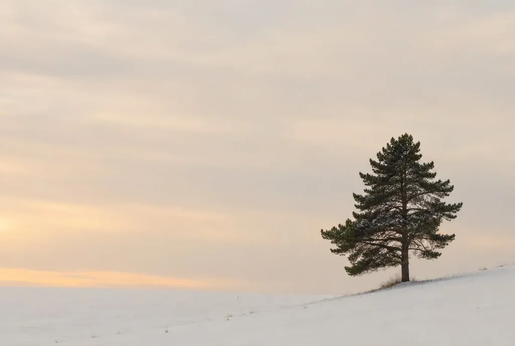 Example generated to illustrate the concept: the tree is dark against a light ground, the sky and snow are uniform, and the emptiness fills the side the frame opens toward.
Now the opposite case. The next image has plenty of empty space, but it isn’t working: the small shrub in the middle is weak, the ground has an uneven texture, and an orange spot at the top right pulls the eye harder than the subject does.
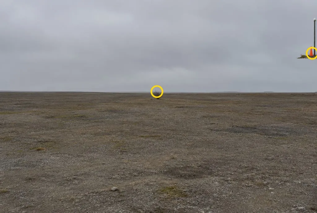 Example generated to illustrate the concept: the two yellow circles mark the weak subject and the orange spot that steals its attention. The emptiness is there, but nobody chose it.
One shortcut for all three checks at once: shrink the photo to a thumbnail, or squint at your screen. If the subject jumps out and nothing competes with it, the space is alive. If your eye bounces around, it isn’t.
How much negative space should you leave?
There is no right percentage: it depends on the subject’s visual weight. A small, low-contrast subject needs a lot of room to be noticed; a dark, heavy one needs less to make itself felt.
Digital Photography School mentions a “2:1 rule” (two parts negative space for each part subject) as a guideline some photographers follow, but the author says she doesn’t tie herself to it. Treat it as a starting point to test, not a law.
A practical way to decide on location is to widen in three steps:
- Shoot with the subject large enough to fill much of the frame.
- Step back, or use a shorter focal length, and shoot again.
- Do it once more. Then compare the three at thumbnail size and keep the one where adding any more empty space would start to make the subject disappear.
For where this sits among the other things a photo is judged on, see how to tell if a photo is good.
Where do you place the subject in the empty space?
Move the subject off-center and leave the emptiness in front of it. A centered subject only works in deliberately symmetrical compositions; in a photo with lots of empty space it usually looks as if it was dropped there, like the shrub in the example.
Three positions that work almost every time:
- On a third. The rule of thirds is a solid starting point: the subject on a line or an intersection, the emptiness on the wider side.
- With room ahead. If the subject moves, looks or points somewhere (a boat, a bird in flight, a person walking), leave more space in that direction than behind it. Crowd it against the edge it is heading for and it feels stuck.
- Very low. With a low horizon, the sky becomes most of the picture and the subject a small presence. It works when the sky has a gradient or interesting light: a flat gray sky gives you a flat gray photo.
Emptiness doesn’t mean giving up lines: a path or shoreline crossing a wide space can lead the eye to the subject. We cover that in leading lines in photography.
Where do you find (and how do you create) empty space?
Look for uniform surfaces that read as “silence”: sky, calm water, snow, sand, a wall. Digital Photography School lists water, sky, walls and sand, surfaces that don’t draw the eye by themselves.
If the scene doesn’t hand you empty space, you can make it:
- Get low to bring in more sky, or get high so uniform ground fills the frame.
- Step back or use a shorter focal length to include more area around the subject.
- Wait for the subject to enter the empty area. A bird, a boat, a person: the composition is ready and only the presence is missing.
- Try black and white. Digital Photography School notes that removing color can turn a busy area into a more uniform one, though it doesn’t always work: it depends on the tones.
- Use fog or haze, which erase background detail and leave the subject in a uniform field.
Watch out for the opposite case: a strip of ground that is there only because it was there isn’t chosen negative space, it’s emptiness that does no work. If you can’t tell whether the lower part of your frame is space or filler, the cover-it test in our piece on foreground in landscape photography works here too.
How do you expose a scene with a lot of bright empty space?
Snow, fog and a hazy sky fool the light meter, which tends to render whatever it measures as a middle gray. In practice a white expanse comes out grayish, and a dirty-gray emptiness isn’t a good emptiness.
Two moves are enough:
- After the shot, check the histogram: if the bulk of the tones sits well away from the right edge while the scene was bright, you underexposed.
- Use positive exposure compensation (start at +0.3 / +0.7 EV) and shoot again, checking the histogram once more.
Digital Photo Mentor describes the mechanism: the meter tries to bring the scene to middle gray, which is why snow turns gray. The same applies to a white sky or dense fog.
Is a photo with lots of empty space “flat”?
Not necessarily. A flat photo lacks light, depth or contrast; a photo with lots of negative space can have all of those and still be essential. What makes the difference is the direction of the light and the contrast between subject and background, as we explain in why do my photos look flat.
The risk is real, though: a big empty area with no light, no gradient and a weak subject gives exactly that effect. When it happens, it usually comes down to one of the three checks.
How does Framia judge it?
Negative space weighs mostly on the composition criterion, and by extension on storytelling, because it tells the eye where to go and what to leave quiet. Emptiness that isolates a clear, well-placed subject works in a photo’s favor. Emptiness that unbalances the frame, or surrounds a subject too weak to carry it, matches the 55-69 band of the rubric: the intent shows, the execution has clear limits.
What to do next
A thirty-minute exercise with any subject (a cup on a table, a tree in a park, a person on a bench) and a uniform surface around it:
- Find an isolated subject with a uniform surface behind it: sky, wall, water, short grass.
- Shoot a first frame tight, with the subject filling the frame.
- Step back or shorten the focal length and shoot a second frame with much more empty space, subject on a third.
- Shoot a third frame with the emptiness on the side the subject faces or moves toward, and a fourth on the opposite side.
- Put the four photos side by side as thumbnails and run the three checks: contrast, quiet, direction. Drop any that get two “no” answers.
- Write one line: what the emptiness does in the photo you kept (isolates, gives scale, slows the eye, balances).
If you want a second opinion on composition, upload the shot to Framia and read the composition score: the explanation tells you whether the emptiness is working or just taking up room.
FAQ
Does negative space have to be completely empty?
No. It can carry texture, thin clouds, ripples or a soft color gradient. What matters is that it stays quiet enough not to compete with the subject: once it contains something that grabs the eye, that spot stops being negative space.
Are negative space and minimalism the same thing?
No. Minimalism uses a lot of negative space and very little subject, but a busy photo can have negative space too, such as the sky above a city. Negative space is a composition tool; minimalism is a style.
Is negative space the same as a blurred background?
No. A blurred background is an optical effect of aperture and distance; negative space is a framing choice. You can have perfectly sharp empty space, like a clear sky or a snowfield, and a blurred background full of shapes.
How do I know if I left too much empty space?
Shrink the photo to a thumbnail and see whether you still find the subject within a second. If you are hunting for it, or the empty area feels forgotten, crop in or step closer. There is no correct percentage: it depends on the subject's visual weight.