Composition Mistakes: 12 to Avoid and How to Fix Them
 by Marco Carotenuto · · 9 min read

You look at a photo you just took and something feels off, but you cannot say what. Often the cause is composition, and the recurring culprits are twelve. None of them needs better gear. They need you to know where to look.
Below you will find the twelve mistakes sorted into four checks, a 30-second test to find which one you are looking at, a fix for each and the cases where a “mistake” is actually a choice.
What are the most common composition mistakes?
There are twelve, and each one shows up when you ask a particular question. This is the map; the details are in the sections below.
| Check | # | Mistake | The fix in one line |
|---|---|---|---|
| Subject | 1 | No clear subject | Decide what the photo is of before you frame |
| 2 | Subject too small | Move closer or zoom in, fill the frame | |
| 3 | Cluttered scene | Change position, exclude or blur | |
| Edges | 4 | Things merging with the subject | Shift your position a few steps |
| 5 | Cuts at joints, objects on the edge | Crop between joints, check the corners | |
| 6 | Tilted horizon | Grid and level first, straighten in editing after | |
| Balance | 7 | Subject dead center out of habit | Move it, or center it only on purpose |
| 8 | Horizon in the middle for no reason | Give more room to the half that tells the story | |
| 9 | No room in front of where someone looks or moves | Leave air in the direction of the gaze | |
| Depth | 10 | No foreground, or one that steals the scene | Look for an entry point, not filler |
| 11 | Always at eye level | Go down or up half a meter | |
| 12 | A rule applied from memory | Decide yourself, and be able to say why |
How do I tell which mistake is in my photo?
Run four checks in order, ten seconds each. The method is ours, designed for looking at a shot cold. The order matters because an upstream mistake makes work on the downstream ones pointless.
- Subject. Shrink the photo to a thumbnail or squint. Say in one word what you see first. If you cannot, or you see two things, look at mistakes 1-3.
- Edges. Cover the center with your hand and look only at the perimeter. Is anything touching, cutting or pulling the eye? Mistakes 4-6.
- Balance. Flip the photo horizontally (an editor does it in one command) and look again. If it now feels heavier on one side, or the subject seems to push against the border, mistakes 7-9.
- Depth. Say where you were standing: how far is the foreground, how far the background, at what height did you shoot? If the answer is “about the same everywhere”, mistakes 10-12.
With practice the test becomes a reflex you run before the shutter, not after.
Is the subject clear and big enough? (mistakes 1-3)
1. No clear subject. You can tell because the eye wanders and never settles. It happens when you photograph “a nice view” instead of one specific thing. Before you frame, finish the sentence “this is a photo of…”. If the answer is “a bit of everything”, you do not have a photo yet. The reason: the camera records everything, while to the naked eye your brain makes you notice only what interests you. That filter does not exist in the photo.
2. Subject too small. The subject is there, but it takes up a sliver of the frame and the rest is space that says nothing. In the photo below the hut sits in the middle and you barely notice it.
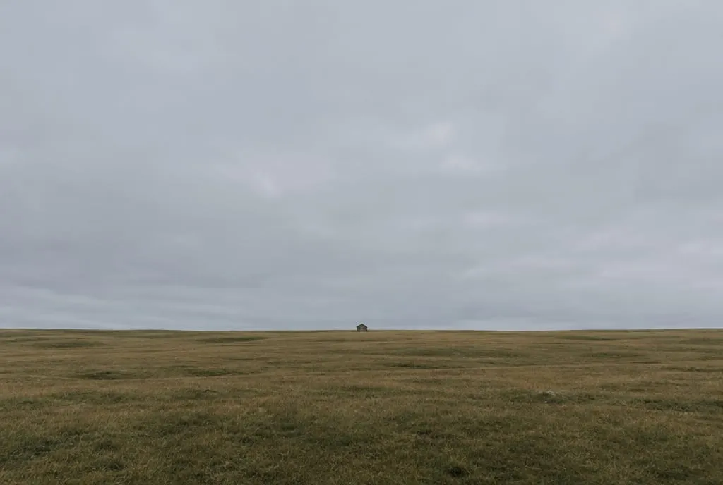 Generated image to illustrate the concept: sky and meadow take up nearly the whole frame and the hut gets lost. The viewer has nowhere to rest.
There are two ways to fix it, and they give different results. Moving closer changes the relationship between planes: what was near grows more than what was far. Zooming enlarges everything equally and flattens perspective. If you want to keep the context, step closer; if you want to leave out what is around the subject, zoom. You can also try cropping: cover the empty half with your hand and see whether the photo improves. If it does, that half was dead weight. For empty space done well, see negative space.
3. Cluttered scene. Too many elements with the same weight, and none that wins. Cover one element at a time with your thumb: if the photo loses nothing, that element is a distraction. Then move, change angle, or use a longer lens to leave out what you do not need. A wider aperture blurs the background, but blur is not enough if the bright blob stays more attractive than the subject.
What is happening at the edges of the frame? (mistakes 4-6)
4. Things merging with the subject. A pole, a branch or a line that seems to grow out of a head or a roof. It happens because the camera flattens planes: two things at different distances line up in the frame. Shifting a few steps left or right, or changing height, is usually enough to separate them.
5. Cuts at joints and objects on the edge. Cropping a person at the wrist, ankle or knee looks like a missing limb: crop midway between two joints, or frame wider. In the same way, a bright object entering from a corner pulls the eye out of the photo. Check all four corners before you shoot.
6. Tilted horizon. This is the easiest mistake to fix and the easiest to miss on a small screen. Use the grid and the electronic level; on a lake or the sea, the water surface is a reliable reference, while ridgelines and roofs can really be slanted. In editing you can straighten, but rotating crops the corners. More in where to put the horizon in a photo.
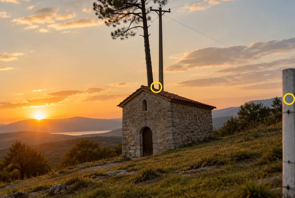 Generated image to illustrate the concept: the yellow circles mark the two mistakes. The pine and the pole seem to grow from the roof (mistake 4), and the white post on the right edge pulls the eye out of the picture (mistake 5).
Why does my photo feel lopsided? (mistakes 7-9)
7. Subject dead center out of habit. Center works when it is a choice, for example with symmetry or a frontal portrait. It becomes a mistake when it is simply where autofocus left the subject. Try moving it to a third and see what happens: if the photo gains air, habit was costing you. The rule of thirds is a good starting point, not an obligation.
8. Horizon in the middle for no reason. It splits the photo into two equal pictures fighting for attention. It works with a crisp reflection or with two truly equivalent halves. Otherwise give two thirds to the half that tells the story: sky if it is the star, ground if the ground is.
9. No room in front of where someone looks or moves. A subject looking or running toward the edge of the frame feels stuck against a wall. Leave more air in the direction of the gaze or the movement, and less behind. It applies to a bird in flight or a path that leaves the frame too: the viewer follows the direction and wants to see where it goes.
Does the photo feel flat or ordinary? (mistakes 10-12)
10. No foreground, or one that steals the scene. A landscape with nothing close looks like a postcard; a foreground that is too big or too interesting hides the subject. Test: cover the lower part with your hand. If the photo loses nothing, the foreground is filler; if it loses everything, maybe it is the subject. See how to pick one in foreground interest in landscape photography, and if the scene still lacks depth, why photos look flat.
11. Always at eye level. It is comfortable, so it is where you shoot without thinking. Go down half a meter to give weight to a flower or a stone in the foreground, or climb a low wall to read a path better. You do not have to do it every time: you have to know you chose.
12. A rule applied from memory. Thirds, diagonals and leading lines are tools for solving a specific problem. If you cannot name the problem, the rule is decoration. Before you shoot, ask what effect you are after, then pick the tool: you can start from leading lines or natural frames if you want to guide the eye.
When is a mistake not a mistake?
When it has a reason you can state in one sentence. Many of the twelve have a case where they work; the difference is that in a mistake the choice is missing, and in a choice it is not.
| Mistake | When it is a choice | How you can tell |
|---|---|---|
| Small subject | The emptiness gives scale or solitude | One element, and the rest of the scene is calm and coherent |
| Center | Symmetry, frontal portrait | The two halves are equivalent |
| Horizon in the middle | Crisp reflection on calm water | Sky and reflection carry the same weight |
| Cut through the body | Very tight portrait | The cut is clean and part of the style |
| Eye level | Neutral perspective, documentary scene | The viewpoint should not draw attention |
If you cannot say why you made a choice, it is probably a habit.
How does Framia rate it?
These mistakes weigh mostly on the composition criterion, one of Framia’s six analysis categories. A photo with one or two of them, but a clear subject and clean edges, usually lands in the 55-69 band of the scale: the intention is visible, the execution has clear limits. Remove the upstream mistake and the rest of the photo often rises with it. For an overview of the criteria see how to tell if a photo is good, and for the full set of choices see the photography composition guide.
What to do next
A 30-minute exercise with ten of your recent photos:
- Pick ten photos you took in the last few weeks. Do not discard any in advance.
- Run the four checks on each, in order: subject, edges, balance, depth. For each photo, write down the number (1 to 12) of the first mistake you find.
- Count which group shows up most. That is your weak spot.
- Pick one photo from that group and reshoot or recrop it, fixing only that mistake.
- Compare the two versions as thumbnails. Is the second better? Write one line on why.
- On your next outing, keep one mistake in mind: the one from your most frequent group.
For a second opinion, upload one of the photos to Framia and read the composition category score: the explanation tells you which of the four checks it fails.
FAQ
What is the most common composition mistake?
There is no measured ranking, but Nikon School names too much empty space as the most common composition mistake: the subject stays small and far away, and the viewer cannot tell what the photo is about. It is also one of the easiest to fix: step closer or zoom in.
Can I fix composition mistakes in editing?
Only some of them. A crop handles a subject that is too small, a tilted horizon and some edge problems, but it costs pixels. You cannot fix a pole growing out of a head, a missing foreground or a viewpoint that is always the same: those are solved in front of the scene. That is why it pays to fix them before you shoot.
Do the same mistakes apply to phone photos?
Yes, and if your phone has a grid in the camera settings you can use it to check the horizon and verticals. What changes is how you fix them: a phone lets you move faster and try different heights, but it usually gives you less background blur to hide distractions, so position matters even more.
I have several mistakes in one photo. Where do I start?
Follow the order of the four checks: subject first, then edges, then balance, then depth. If the subject is unclear, cleaning up the edges will not save the photo; if the subject is clear, one or two tweaks to the rest are usually enough.
Is the rule of thirds enough to avoid these mistakes?
No. It covers three of the twelve at most: a habitually centered subject, a horizon in the middle and, in part, visual weight. It does not tell you whether the subject is clear, the edges are clean or there is depth. It is one tool among several, and you can break it when you have a reason.