How to Tell If a Photo Is Good: 6 Criteria Pros Use
 by Marco Carotenuto · · 6 min read

“Is it good?” is the wrong question. It’s too vague to have a useful answer, and the honest answer is almost always “partly”. Experienced photographers don’t ask whether a photo is good: they break it into separate layers, judge each one, and look for the one that’s holding it back.
In this guide you’ll find the six criteria Framia uses to analyze every shot, the scale it scores them on, and an exercise to start training your eye today.
Why is it so hard to judge your own photos?
Because when you look at your own photo you don’t just see the photo: you see the memory. You remember the cold, the climb, the thrill of the sunrise. Someone who wasn’t there only sees what’s inside the frame.
The second problem is that “good” lumps everything together. A great subject can hide weak composition; stunning color can make you forget the focus missed. If you judge the photo as a whole, you don’t know what to fix. If you judge it criterion by criterion, you do.
What are the 6 criteria for evaluating a photo?
Six questions, one for each layer of the image. Answer them one at a time, without letting the others sway you.
| Criterion | The question to ask | Typical mistake |
|---|---|---|
| Composition | Does the eye know where to go and what to look at? | Subject dead center for no reason, messy edges |
| Light | Does the light give the subject shape and mood? | Flat midday light, blown highlights |
| Optics | Do focal length and depth of field serve the idea? | A wide angle that shrinks the subject |
| Color | Are the colors coherent and intentional? | Unwanted color casts, oversaturation |
| Story | Does the photo say more than “I was here”? | No clear subject, no emotion |
| Technique | Are focus, exposure and sharpness under control? | Camera shake, crooked horizon, noise |
Composition: does the eye know where to go?
Composition is the path you make the viewer’s eye travel. Good composition has a recognizable subject, an entry point (often at the bottom of the frame) and nothing at the edges pulling attention away.
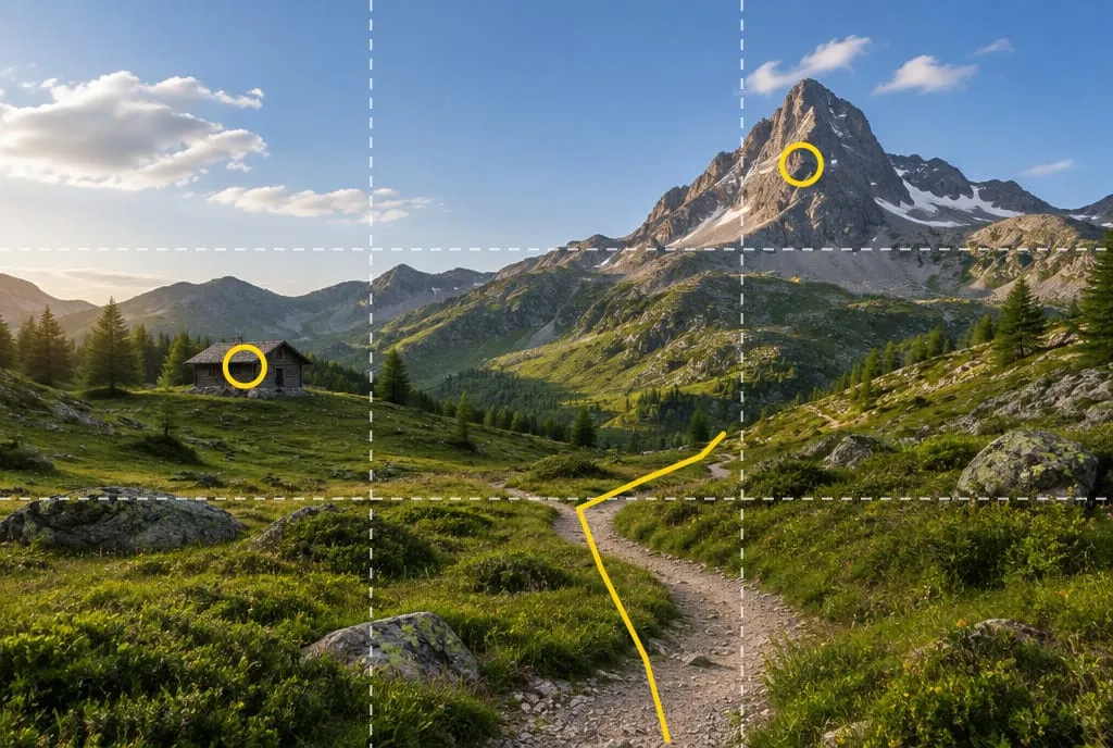 The trail (in yellow) brings the eye in from the bottom and leads it to the peak, close to a strong point of the rule-of-thirds grid. The hut balances the weight on the left.
A quick test: look at the photo at thumbnail size, as small as a postage stamp. If the composition holds up, it’s solid. If it turns into a confusing blur, the problem isn’t sharpness: it’s how the shapes are arranged.
Light: does it shape the scene or flatten it?
Light isn’t just there so you can see: it decides volume, texture and mood. Low side light sculpts mountains; the same scene at noon goes flat. Ask where the light is coming from, how hard it is, and whether the most important areas are also the brightest. The eye always goes to the light areas first.
Optics: does the focal length serve the idea?
Wide angles and telephoto lenses tell the same scene in opposite ways. A wide angle exaggerates the distance between foreground and background; a telephoto compresses it. A common mistake is reaching for the wide angle “to fit everything in” and ending up with a tiny subject lost in empty space. Check depth of field too: is the right thing sharp, and is whatever would distract blurred?
Color: coherent or accidental?
A coherent palette (a few dominant colors that work together) makes a photo feel deliberate. An unintended magenta cast or a sky cranked to maximum saturation makes it feel like an accident. Check grays and whites: if they’re not neutral and that’s not a choice, fix the white balance.
Story: does it say something?
This is the criterion that separates a correct photo from one you remember. Ask yourself: if someone saw only this image, what would they understand? A person giving the mountain scale, a gesture, a contrast between two elements: all ways to add a story. “Nice place” isn’t a story.
Technique: the foundation
Focus, exposure, motion blur, horizon, noise. It’s the least creative criterion and the most unforgiving: one serious technical error (subject out of focus, blown-out sky) can sink a photo that’s great at everything else. Check the histogram: if it’s crushed against the right edge, you’ve lost highlight detail, and it often can’t be recovered.
How do you score a photo from 0 to 100?
With a scale that has clear anchors. Without them, every score lands between 75 and 85 and tells you nothing. This is the same scale Framia uses for each criterion:
| Score | What it means |
|---|---|
| 90-100 | Portfolio or award level: flawless execution and original vision. Very rare. |
| 80-89 | A strong, publishable shot: no significant flaw, a clear idea. |
| 70-79 | Good: it works, but one or two fixable flaws remain. |
| 55-69 | Competent but ordinary: the intent shows, the execution has clear limits. The normal band for a good amateur shot. |
| 40-54 | Snapshot: flaws that get in the way of reading the image. |
| 25-39 | Serious errors: motion blur, out of focus, broken exposure. |
| 0-24 | Failed image. |
Two rules for using it well. First: when you’re torn between two scores, pick the lower one. Leniency doesn’t make you better. Second: a technically correct photo with nothing remarkable is a 55-65, not an 80. If one of your amateur shots gets a 62, that’s not a fail: it’s where almost everyone starts.
What’s the most common mistake when judging your own photos?
Averaging. If a photo scores 80 on composition, 78 on light, 75 on color and 30 on technique because the subject is blurred, the average says 66, “decent”. But viewers only see the blur. A serious flaw in one criterion outweighs the sum of the others.
So once you have six scores, don’t look at the total: look at the lowest one. That’s where the biggest jump in quality hides, for the least effort. Pushing composition from 80 to 85 is hard; taking technique from 30 to 70 with a faster shutter speed is easy.
Asking for feedback: forums, friends or AI?
Each has its limits. Friends are kind. Groups and forums give useful but conflicting opinions, often about taste (“I’d have done it in black and white”). Likes measure how well a photo stops the scroll, not how well it’s made.
A structured analysis has the advantage of always being available and of keeping the criteria separate. That’s why we built Framia: you upload a photo and get a score and an explanation for each of the six layers, with the why and a concrete tip. Feedback from an experienced photographer in person is still precious, especially for story: use both.
What to do next
A 15-minute exercise to train your eye:
- Pick five of your photos taken at least a week ago (the distance helps you forget the memory).
- Score each one from 0 to 100 on the six criteria, using the scale above. Write the scores down: memory cheats.
- Mark the lowest criterion in each photo.
- Count which criterion is lowest most often. That’s your weak spot, not a single photo’s problem.
- On your next outing, focus only on that criterion. One at a time.
If you want a second opinion on those five photos, upload them to Framia and compare your scores with its scores: the biggest gaps show you where your eye is still too lenient.
FAQ
Is a technically perfect photo always a good photo?
No. Correct sharpness and exposure are the minimum for an image to read, but a photo without a clear idea stays ordinary. On Framia's scale, a technically correct shot with nothing remarkable scores 55 to 65 out of 100, not 80.
Do likes tell you whether a photo is good?
Likes measure how well a photo stops the scroll, not how well it's made. They depend on timing, audience and the algorithm. To improve, you need a judgment across the six criteria, not a counter.
How do I judge my own photos without being too lenient?
Wait at least a day before reviewing them, look at them small (thumbnail size) to judge composition, and ask what you would remove. If you're torn between two scores, pick the lower one: it's the same rule Framia's rubric uses.
Is there an objective way to evaluate a photograph?
Taste is subjective, but the criteria aren't: a tilted horizon, an out-of-focus subject or blown highlights are flaws for anyone. Scoring criteria separately removes much of the arbitrary part of the judgment.