Amateur vs Professional Photos: 8 Differences That Matter
 by Marco Carotenuto · · 8 min read
You look at a photo and think “whoever shot this knows what they’re doing”, without being able to say why. It’s rarely the camera and rarely the editing. It comes down to a few choices you can see in the frame, and you can check them one by one.
Here’s what “professional” really means for a photo, eight differences with a ten-second test each, and an exercise for applying them to your own shots. For the full scoring scale, start with how to tell if a photo is good.
What does “professional” mean for a photo?
For people who do it for a living, “professional” describes how they earn money, not how good a photo is. A professional makes an income from photography; an amateur, from the Latin amator, “one who loves”, shoots for the love of it. There’s a wide middle ground: an advanced amateur can own the same gear and produce work as good as a working pro’s.
So the useful question isn’t who took the photo, but what’s in the frame. There is one real difference, and it’s about method. Someone shooting for a client can’t afford to miss, so they build habits that deliver a decent result every time. An amateur can experiment and fail, which is a creative advantage, but often leaves to chance what a method settles in advance. The eight differences below are those habits.
What are the 8 visible differences between amateur and professional photos?
Eight checks you can run on any photo, yours or someone else’s. Seven match criteria on the Framia scale; the eighth, selection, is about the set of shots rather than a single frame.
| # | Difference | Looks amateur | Looks polished | 10-second test |
|---|---|---|---|---|
| 1 | Subject | Several elements of similar weight | One recognizable subject | Describe it in one sentence: can you? |
| 2 | Edges | Cut-off or bright objects at the margins | Calm margins, nothing pulling attention | Scan all four sides |
| 3 | Light | Whatever was there | Chosen for time and direction | Where do the shadows fall? Why are you there at this hour? |
| 4 | Exposure | Left to automation | Controlled | Histogram: no spike against an edge without a reason |
| 5 | Optics | Default focal length and aperture | Chosen for the idea | What’s sharp, and does it serve the idea? |
| 6 | Color and editing | Pushed saturation, color casts | A few coherent hues | Neutral grays; the edit isn’t noticed before the photo |
| 7 | Selection | Show the first shot, or all of them | One pick from several variants | How many variants of the scene do you have? |
| 8 | Intent | “I liked the place” | A reason behind each choice | Complete: “I shot it this way because…” |
Differences 1 and 2: is the subject clear and are the edges clean?
The eye goes to the most contrast, the most color or the most light. If that isn’t your subject, the photo loses. The one-sentence test is the fastest: if describing the image takes three “ands” (“the lake, and the hut, and the trail…”), there isn’t a real subject. Then check the edges, where attention escapes: a bright object cut in half pulls the viewer out of the frame.
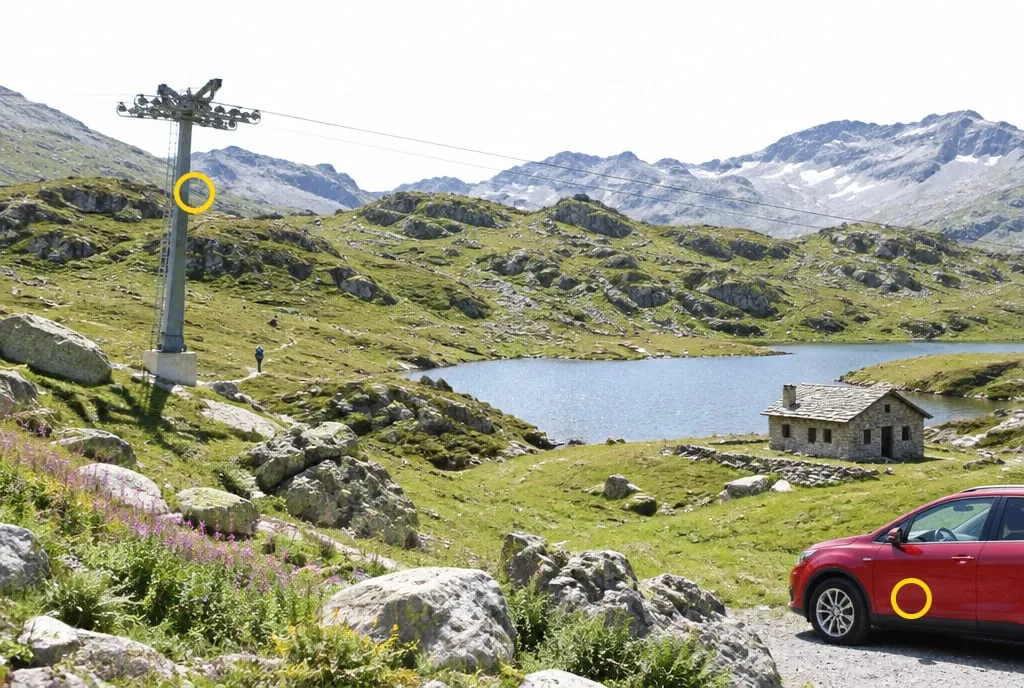 Example generated to illustrate the concept: pylon, hiker, hut, lake and car carry similar weight. The yellow circles mark the pylon and the red car, cut off by the edge: they draw the eye more than anything else.
Below, the same kind of place with a decision made: one larch alone in the left third, meadow and ridges fading behind it, nothing flashy at the margins.
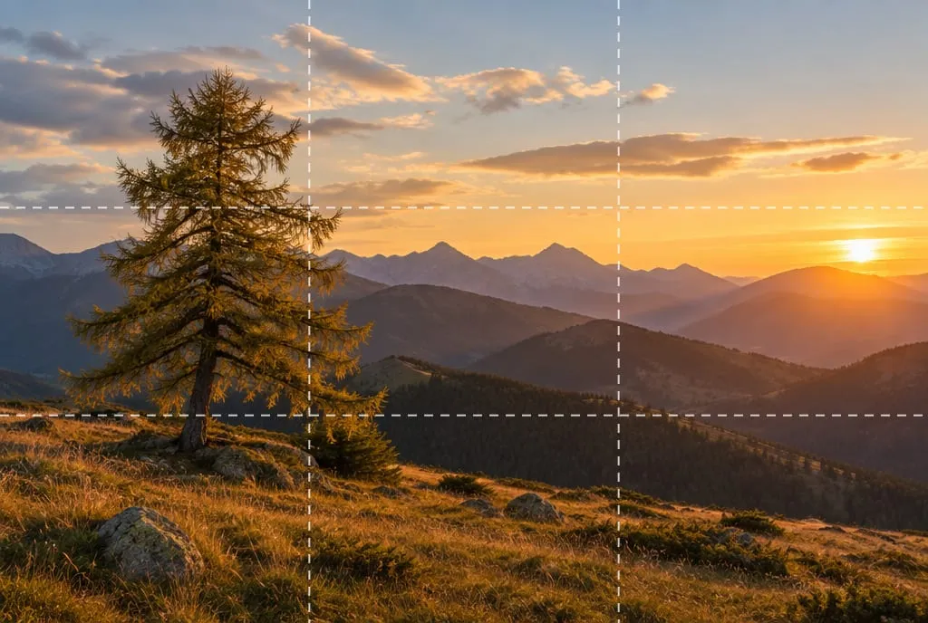 Image generated to illustrate the concept: the larch fills the left third, the low sun balances the right and the margins stay clean.
How to fix it in the field: move a few steps to push the distraction out of the frame, get closer to the subject instead of going wider, and check the edges before you shoot, not after.
Difference 3: was the light chosen or put up with?
Photographers with a method decide when to be on location and where the light comes from; everyone else takes what’s there. In the meadow image the midday light is high and hard: short shadows, a burnt sky, flattened volumes. In the larch image the low sun sculpts the terrain and adds warmth.
The test: find where the shadows fall. If there are none, or they fall behind the subject, the light isn’t working for you. The fix is changing the time or the direction, not rescuing the file; we go deeper in why do my photos look flat. Under overcast skies, don’t chase drama: pick subjects that thrive in soft light.
Difference 4: is exposure under control?
Automatic exposure works in many scenes and fails in the hardest ones: bright skies, backlight, dark scenes with one point of light. The quickest check is the histogram, which shows how tones are distributed from shadows (left) to highlights (right), as Cambridge in Colour explains.
- Spike pressed against the right edge: lost highlights. In JPEG they don’t come back; in RAW you recover only part. Underexpose by a third or two thirds of a stop and reshoot.
- Spike against the left edge: crushed shadows. Fine if it’s a choice (a silhouette at sunset), not if you’ve lost detail.
- Everything bunched in the middle: low contrast, a grayish image.
A spike at an edge isn’t always a mistake: a sun in the frame will clip. The mistake is not having decided.
Difference 5: do focal length and aperture serve the idea?
Optics is a set of decisions, not settings. A wide angle takes in more but shrinks distant subjects; a telephoto brings things closer and compresses planes; a wide aperture isolates the subject by blurring the background, a narrower one keeps more depth sharp. Depth of field depends on aperture, distance to the subject and focal length, as the Cambridge in Colour guide shows.
The test is one question: what’s sharp, and does it serve the idea? In a landscape with a close foreground, a mid-closed aperture like f/8 to f/11 keeps more planes in focus, and you avoid extreme values because diffraction softens detail. In a portrait or a detail shot, a blurred background removes visual noise. The typical flaw isn’t a wrong setting; it’s no decision at all.
Difference 6: are color and editing restrained?
Coherent color means a few dominant hues that sit well together. The most recognizable sign of an amateur photo is the opposite: saturation pushed everywhere, unnatural skies and heavy sharpening. The test has two parts. First, check the grays and whites: if they’re not neutral and that’s not a choice, fix the white balance. Second, put the original next to the edit: if you notice the edit before the photo, you’ve overdone it.
For editing, follow a last-step rule: light and contrast first, then color, and saturation last, in small doses.
Difference 7: do you choose from several variants or show the first?
People who shoot for work make several variants of the same scene (framing, moment, exposure) and pick one. The test is simple: for a scene you like, how many near-identical frames do you have? If the answer is one, you never got to choose.
This explains why pros seem to “get it right every time”: part of that consistency comes from selection. Shoot two or three variants, changing one thing at a time (position, height, moment), then cut ruthlessly.
Difference 8: is there a reason behind the photo?
A polished photo has a because: I shot here, at this hour, with this focal length, because I want to show this. “I liked the place” isn’t enough, because viewers don’t have the place in front of them: they only have what you framed.
On photography tours you often notice that people who improve fastest ask the question before they shoot, not after. If the answer is vague, the framing probably will be too. To hand an intent to someone for feedback, use the brief in photo critique: how to ask for it and actually use it.
Can an amateur make professional-looking photos?
Yes, and you already do whenever all eight choices are present. On Framia’s scale, a competent but ordinary photo sits between 55 and 69, the normal band for a good amateur shot; 70 to 79 is a photo that works with one or two fixable flaws; 80 and up is publishable. The jump rarely needs better gear. It almost always needs one more decision before you press the shutter.
What still separates you from someone who does it for a living is consistency. An 82 once in twenty shots is luck; a 75 every time is method. And method can be trained. If you want to know how far to trust an automatic score, read AI photo analysis: what it really sees.
What to do next
A one-hour exercise, one outing:
- Go out planning to shoot three scenes, and for each make at least three variants, changing only one thing.
- At home, pick your best from each scene. Write one line on why (difference 8).
- Run the table’s eight tests on those three photos and mark every one that fails.
- Count the marks per difference. The one that shows up most is the habit to change: work on only that one on your next outing.
- A few days later, repeat the tests on the new photos and compare.
For a second opinion, upload the three photos to Framia: the score for each criterion (composition, light, optics, color, story, technique) shows whether your marks match what a structured analysis sees.
FAQ
Do I need an expensive camera to make photos that look professional?
No. Subject, edges, light, intent and selection have nothing to do with gear. A better camera mostly helps with optics and low light, but if the other choices are missing, it just records an ordinary photo in more detail.
Are professional photos always heavily edited?
No. Editing develops the file you started with; it doesn't rescue a bad shot. If viewers notice the edit before the photo, it's usually too much: pushed saturation, halos and over-sharpening are among the most recognizable signs of an amateur photo.
How can I spot my own flaws if I tend to be lenient with myself?
Wait a few days, look at the photo as a thumbnail, and run the table's tests one at a time, writing down the answers. For outside eyes, the four-line brief in the photo critique article helps you get comments you can use.
Can a smartphone photo look professional?
Yes, on seven of the eight: subject, edges, light, exposure, color, selection and intent. A phone has more limits on optics, such as a blurred background, but a well-chosen, well-lit scene matters more than sensor size.