Famous Photographs Analyzed: 5 Shots, Criterion by Criterion
 by Marco Carotenuto · · 8 min read
Most articles on famous photographs tell the story behind the shot, or offer an interpretation that doesn’t help you decide what to do with your own camera. Here we do the opposite: we read five photographs through the criteria we use at Framia, and take from each one a habit you can try this weekend.
We don’t score the masters: a score is there to improve your photos, not to judge history. The images in this article are generated illustrations of the concepts; you’ll find the original photographs through the links to the archives and museums.
How do you read a famous photograph without getting lost in its history?
Pick one guiding criterion and look at the photo through that alone. The six criteria (composition, light, optics, color, story, technique) are explained in how to tell if a photo is good; here each photograph brings one to the front, the one it teaches best.
| Photo | Year | Guiding criterion | Habit to borrow |
|---|---|---|---|
| The Steerage, Stieglitz | 1907 | Composition | Look for shapes before the subject |
| Behind the Gare Saint-Lazare, Cartier-Bresson | 1932 | Technique (timing) | Fix the background and wait for the subject |
| Migrant Mother, Lange | 1936 | Story | Move closer in small steps, from the same side |
| Moonrise, Hernandez, Adams | 1941 | Light | Decide which area gets the best light |
| Earthrise, Anders | 1968 | Color | One color accent against a neutral field |
What does Stieglitz’s The Steerage (1907) teach about composition?
It teaches you to see shapes before the subject. In June 1907 Alfred Stieglitz was sailing to Europe aboard the Kaiser Wilhelm II and, from a raised spot, looked down at the third-class deck. He later described a round straw hat, a mast leaning left, a stairway leaning right, a white gangway with a chain railing: “shapes related to one another,” in his words, and beneath them a feeling about life.
He ran to his cabin for his camera, a hand-held 4×5 Auto-Graflex, and had only one plate ready: he went back and exposed it once, according to the account on Wikipedia drawn from his own writing. He published the photograph in 1911 and exhibited it in 1913.
Habit to borrow: before you decide what to photograph, squint and look for repetitions: circles, opposing diagonals, light and dark blocks. Then move until the shapes line up the way you want. If you only get one chance, the decision has to come before you press the button.
What does Cartier-Bresson’s Behind the Gare Saint-Lazare (1932) teach about timing?
It teaches that timing is prepared: you choose the background and wait for the subject to step into it. Henri Cartier-Bresson shot with a portable Leica, peering through gaps in the planks of a fence around repair work behind the station at Place de l’Europe in Paris. A man leaps over a flooded patch without touching it, his reflection below him, a half-submerged ladder beside. The frame is the instant before contact with the water.
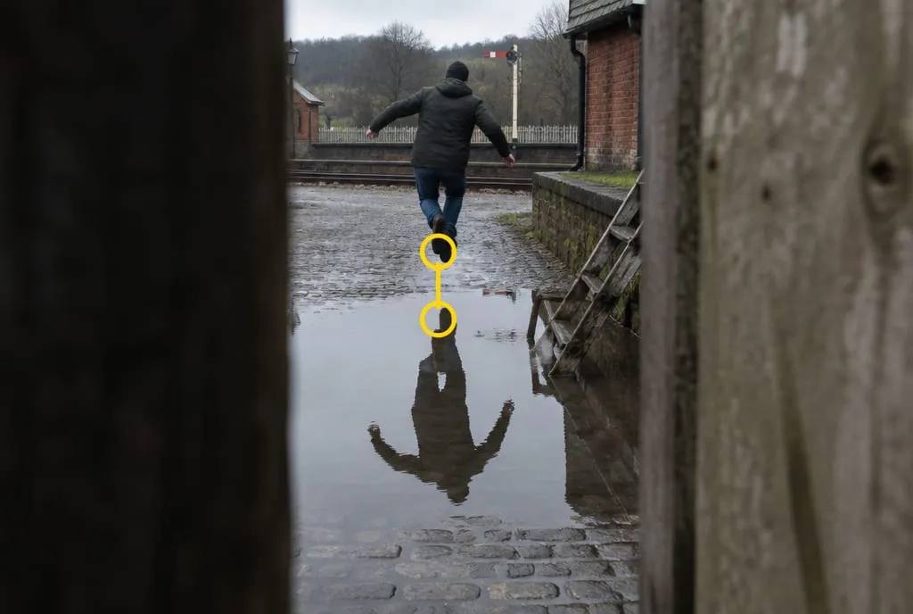 Generated image to illustrate the concept, not a recreation of Cartier-Bresson’s photograph: the fence works as a frame, the jump is caught before contact, and the yellow circles mark the shoe and its reflection, the gap that creates the tension.
Two details, both stated by him according to the sources, are lessons in themselves. The image is cut off on the left because the gap between the planks was too narrow for his lens: it is one of the few photographs he cropped. And the posters on the wall, with dancers that seem to echo the man’s movement, he only noticed after the shot.
Habit to borrow: choose a background that works even without a subject (a gap, a doorway, a puddle), frame it and wait. To freeze a jump you need a fast shutter speed, 1/500 s or faster. Press an instant before the peak: there is always a delay between what you see and the click. And when you review the result, look for what was in the frame that you hadn’t seen.
What does Lange’s Migrant Mother (1936) teach about story?
It teaches that a story is built by moving closer, not by zooming. In March 1936, in Nipomo, California, Dorothea Lange was finishing a month-long trip photographing migrant farm workers for the Resettlement Administration. In the account quoted by the Library of Congress, she approached the mother of seven and made five exposures, “working closer and closer from the same direction.” She used a Graflex with 4×5 inch negatives.
The famous picture is therefore one frame from a series, and the Library of Congress holds the others: open them and compare. With each step closer, something leaves the frame and the story changes.
Habit to borrow: shoot the same scene three times, wide, medium and tight, staying on the same side, then pick the one that tells the story with the fewest elements. With people, one rule comes before technique: explain why you’re photographing and respect their answer.
What does Adams’s Moonrise, Hernandez (1941) teach about light?
It teaches you to decide which part of the image gets the best light, and to do it before the light is gone. On November 1, 1941, Ansel Adams was driving back to Santa Fe, disappointed, when he saw the village, the cemetery and the Moon over the snow-dusted mountains. According to the Ansel Adams Gallery, he pulled over, set up his 8×10 inch camera and couldn’t find his exposure meter; he knew the Moon’s luminance by heart and worked out the exposure from that. A second later the light on the crosses was gone.
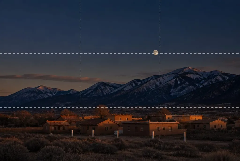 Generated image to illustrate the concept, not a recreation of Adams’s photograph: warm light reaches only the rooftops, the dark sky dominates the upper part, and the moon sits near a thirds intersection.
But light doesn’t end at the negative. The earliest prints, the same gallery writes, are softer, with more muted clouds; later Adams darkened the sky almost to black and made the crosses glow. The Getty’s copy, for example, is a print dated December 16, 1948, seven years after the negative.
Habit to borrow: before sunset, choose the area that has to stay readable (rooftops, a face, a path) meter the light on that area (using spot metering, if your camera has it) and check the histogram: what Adams worked out in his head, you can verify in three seconds. To see why low, raking light gives shape and diffuse light flattens, read why do my photos look flat.
What does Anders’s Earthrise (1968) teach about color?
It teaches that a single color accent on a neutral field guides the eye without any other help. On December 24, 1968, Apollo 8 astronaut Bill Anders photographed the Earth above the lunar horizon. NASA describes a dull gray horizon filling the bottom quarter of the frame and a blue and white Earth almost at the center, with the bottom third of the Earth out of view. Everything else is neutral, which is why a centered subject works.
There is an orientation lesson too. According to Wikipedia, the original image, as the astronauts saw it, was rotated 95 degrees clockwise to produce the published orientation, which better conveys the idea of an Earth rising. Same photo, different horizon, different meaning.
Habit to borrow: when color is the subject, look for one vivid hue against a nearly neutral background and leave the rest out. Then rotate the photo 90 degrees and see whether the story changes.
What do the five photographs have in common?
In all five, a decision made after the shutter click is part of the result: having taken the photo and having finished it are not the same thing.
- Stieglitz: the publication, four years after the shot.
- Cartier-Bresson: the crop on the left.
- Lange: the choice within a series of exposures.
- Adams: the print, redone over the years with a darker sky.
- Anders: the rotation that changed the meaning.
It is difference number seven in amateur vs professional photos: choosing among several versions instead of showing the first one. To compare two versions a few days apart, at thumbnail size, before deciding which to keep, see photo critique: how to ask for it and actually use it.
What to do next
A one-week exercise, with a single outing:
- Pick just one of the five habits in the table, the one furthest from how you usually shoot.
- Go out and shoot three scenes applying it: for each, at least three variations, changing one thing at a time.
- At home, view the photos as thumbnails, stamp-sized, and choose one per scene.
- Write one line per photo: “I shot it this way because…”. If you can’t find the reason, there wasn’t one.
- A few days later, look at them again: does the choice you made still hold up?
If you’d like a second opinion, upload the three photos you picked to Framia: the score for each criterion tells you which one to start with and whether it matches the reason you wrote in step 4.
FAQ
What is the most famous photograph in the world?
There is no objective ranking: it depends on what you measure (reach, historical influence, auction price). For learning, which one is most famous matters less than what it teaches you. Pick one and read it through a single criterion.
Do I need the same gear as the masters to learn from these photos?
No, because the lessons are about decisions, not equipment. Stieglitz shot with a hand-held Graflex and had only one plate ready; the habits you take from him (look for shapes, decide before you press) work with any camera.
Are famous photographs technically perfect?
Not necessarily. Cartier-Bresson explained that the gap between the fence planks was too narrow for his lens, which is why the image is cut off on the left. What counts is that the choices support the idea, not the absence of limits.
Where can I see these photographs in good quality?
On the sites of the institutions that hold them: the Library of Congress for Migrant Mother, NASA for Earthrise, the Getty for Moonrise and MoMA for Cartier-Bresson. We don't reproduce them here: the images in this article are generated illustrations of the concepts.