Rule of Thirds: How to Use It and When to Break It
 by Marco Carotenuto · · 8 min read

You turned on the grid, put your subject on an intersection, and the photo still came out so-so. Or you ignored the grid, centered everything, and sometimes it looked great. Both are normal, because the rule of thirds is a shortcut for making a decision, not a guarantee of a good photo.
Here’s what it is, why it works, how to apply it to subject, horizon and gaze, and a three-question test for knowing when to ignore it. It’s one piece of composition; for the bigger picture of how to judge a shot, start with how to tell if a photo is good.
What is the rule of thirds, and where does it come from?
The rule of thirds is a composition guideline: you imagine the frame cut into nine equal rectangles by two vertical and two horizontal lines, then place important elements along those lines or at the four points where they cross.
It didn’t start with photography. The phrase “rule of thirds” was first written down in 1797 by John Thomas Smith in Remarks on Rural Scenery, writing about landscape painting: give the sky about two-thirds of the picture, or about one-third, and let the land take the rest. He was building on Joshua Reynolds’s thinking about balancing light and dark (Wikipedia). The core idea still holds: a 2-to-1 split is more interesting than an exact half.
Why does it work (and why isn’t it a law)?
It mostly works because it pulls you away from the two choices everyone makes without thinking: the subject planted in the middle and a horizon slicing the photo in half. Moving elements off-center gives you a “full” area and a “breathing” area, and the eye gets a path instead of a bullseye.
It isn’t a law. Adobe’s guide quotes a photographer saying it’s “not really a rule” but a guideline, and plenty of great photos ignore it. Treat it as a starting point: the grid offers a solution, and you check whether it serves what the shot is about.
How do you apply it in four moves?
Run the same four steps in the same order every time; it takes a few seconds. Start with the grid on your screen and answer:
- What’s the subject? Can you name it in three words? If not, no grid will save you.
- Where’s the horizon? Put it on one of the two horizontal lines, not halfway.
- Where does the subject go? On a vertical line or, if it’s small and precise, on an intersection.
- What’s in the rest of the grid? The “empty” side isn’t wasted: it gives room, direction or balance. Still check the edges, because cut-off branches and half objects pull the eye out of the frame.
In the image below, the horizon sits on the lower horizontal line, so the sky, the richer part, gets the top two-thirds. The boat is in the right-hand column and the sun in the left-hand one, so the two masses balance each other.
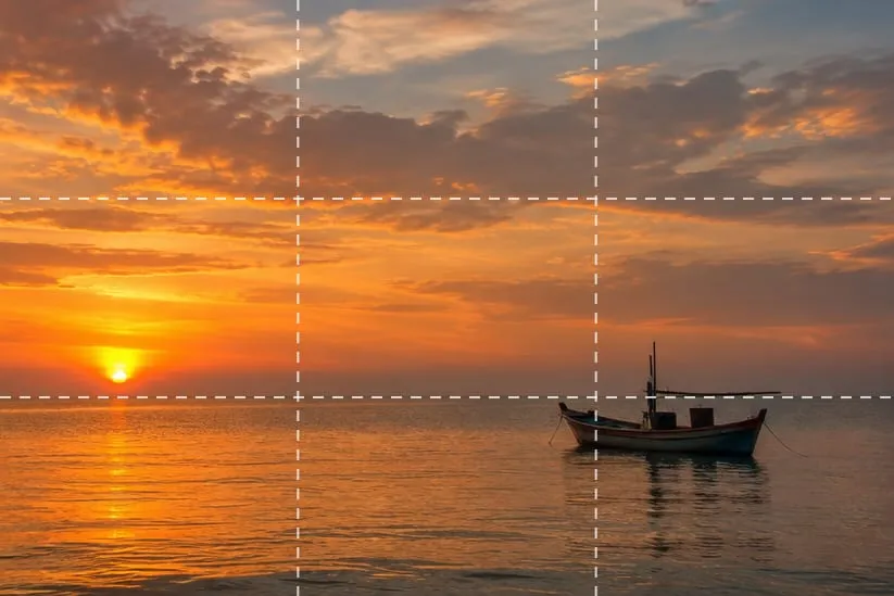 Horizon on the lower line, sky in the top two-thirds, boat and sun in different columns. Generated image made to illustrate the concept, not a real photo of a real place.
Should the horizon go high or low?
Give two-thirds of the frame to the more interesting half. If the sky has clouds, color or light, put the horizon on the lower line; if the sky is empty and the real subject is the ground (a meadow, rocks, a reflection), raise the horizon to the upper line.
A horizon at halfway works in one case: when you’re after symmetry, as with a reflection. Otherwise the photo reads like two pictures competing for attention. A foreground helps you decide: add one (we cover it in why do my photos look flat) and the bottom fills up, so you can afford more sky.
Where do you place a subject that looks or moves somewhere?
Put the subject on a vertical line and leave more room in front of them than behind. That space in the direction of the gaze or movement is called lead room, and it matters because the eye follows the subject: push them against the edge they’re heading for and the photo feels stuck.
For portraits, the usual advice is to put the eyes on the upper horizontal line. For anyone moving, the subject sits in the column they’re leaving, not the one they’re heading toward: the rest of the frame is the road ahead.
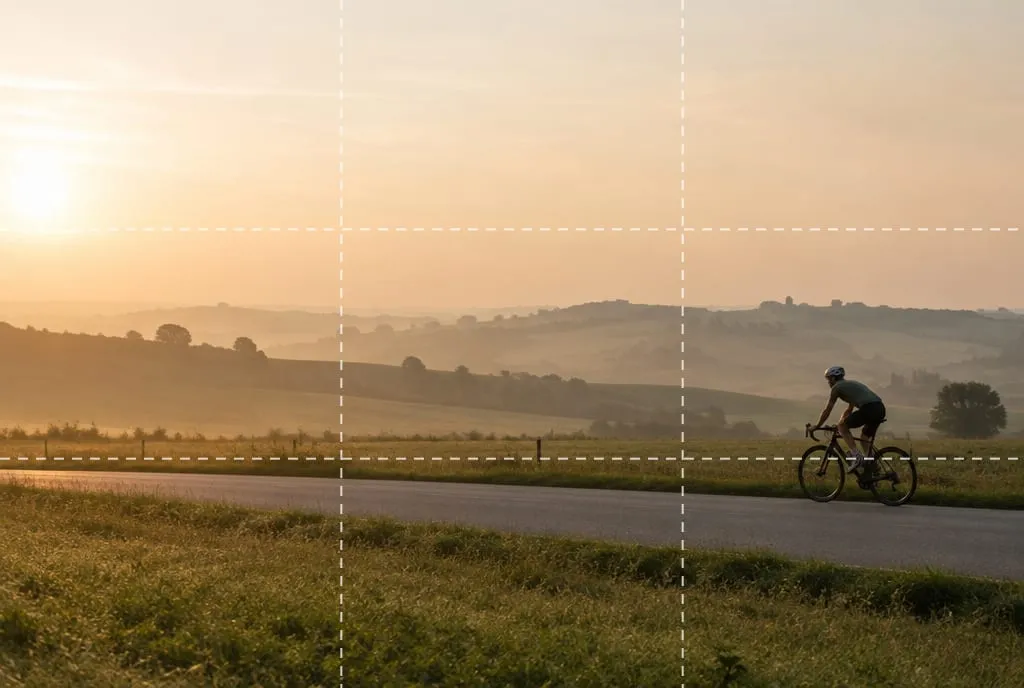 The cyclist sits in the right column and rides left: the empty space ahead gives the movement room. Generated image made to illustrate the concept.
When should you break the rule of thirds?
Break it when the center, or some other position, has a reason. The rule is a shortcut for when you don’t have a better one: if you do, follow yours. These are the most common cases:
| Situation | Why the center works | What to check |
|---|---|---|
| Symmetrical scene (bridges, reflections, head-on architecture) | Symmetry only reads when the axis is in the middle | Straight axis, level horizon |
| Subject that fills most of the frame | There’s no “background” left to balance | Clean edges, no accidental cuts |
| Repeating patterns or textures | There’s no focal point, there’s a rhythm | That the repetition has a break |
| Minimalism with a single element | The center adds strength and calm | A truly empty background |
| Intense, head-on portrait | A direct gaze can hold the center | Not too much space above the head |
Below is a scene where centering is the right call: the vertical axis cuts the bridge and its reflection in half, and the two sides mirror each other.
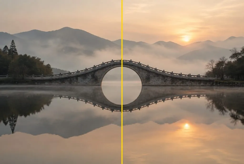 The yellow line marks the axis: in a symmetrical scene, the center is a decision, not a mistake. Generated image made to illustrate the concept.
The difference between breaking the rule and ignoring it is intent. If you center because you chose to, that’s composition. If you center because you didn’t think about it, that’s a default.
Rule of thirds or golden ratio: which should you use?
In practice the difference is small. On a thirds grid the lines sit at 33% and 67% of each side; with the golden ratio (about 0.618) they sit at 38% and 62%. That’s five percentage points apart, almost invisible when you’re framing.
Use the thirds grid because it’s already on your screen. If a subject doesn’t feel right exactly on the line, nudge it slightly inward: the sweet spot is often between the line and the center.
What’s the 3-question test for deciding?
Before you shoot, ask yourself these three things, in this order. The test turns the rule into your own decision, and it takes a few seconds.
| Question | If yes | If no |
|---|---|---|
| 1. Is the subject looking or moving somewhere? | Put them on the opposite line and leave room ahead | Go to question 2 |
| 2. Is one part of the scene much richer (sky, foreground)? | Give it two-thirds of the frame and place the horizon accordingly | Go to question 3 |
| 3. Is the scene symmetrical, or does the subject fill the frame? | Center it and check the axis | Use a thirds line or an intersection |
If two answers conflict, the first one wins: gaze and movement matter more than geometry.
What mistakes come up most often with thirds?
There are four, and they share a root: using the grid as an obligation instead of a tool.
- Subject on the “wrong” third. Placed close to the edge it’s looking toward, it seems to walk out of the photo: move it to the other side.
- Horizon on the third but tilted. The grid also helps you level it: a crooked horizon ruins the shot even if it’s on the right line.
- Empty space with no job. Two-thirds of dull sky or messy background doesn’t give breathing room, it gives boredom. Empty space needs a function.
- Thirds on everything, always. After a while every photo looks alike, with the subject in the same intersection. Change sides, change lines, try the center.
What to do next
An exercise for one outing, with a still subject like a tree, a bench or a boat:
- Turn on the grid on your screen.
- Shoot the scene with the subject in the center.
- Shoot it again with the subject on the left vertical line, then on the right.
- Shoot three more, changing only the horizon: on the upper line, halfway, and on the lower line.
- View the six shots as thumbnails, stamp-sized. For each one ask: where does the eye go first, and where does it breathe?
- Pick the best and write one sentence: why that placement serves your idea.
For an extra check before you shoot, download the composition checklist below: twelve checks to run before you press the shutter. And if you want a second opinion on your photos, AI photo analysis gives you a composition score with an explanation of why.
FAQ
How do I turn on the rule-of-thirds grid on my phone or camera?
Look for a Grid (or Gridlines) option in your camera settings. On an iPhone it's under Settings, Camera; on Android phones and dedicated cameras the path varies by model. The grid is never saved in the file: it's only there to help you frame.
Can I apply the rule of thirds afterwards by cropping?
Yes, cropping lets you slide the subject and horizon onto the lines. It costs resolution and leaves less room to maneuver, so frame as well as you can at the shot and keep cropping for small adjustments.
Does the rule of thirds work for vertical photos?
Yes, it's the same grid. In portrait orientation the proportions change: the horizon and subject read higher or lower, and the room in front of a subject usually shrinks. Check that the scene still has space to breathe in the direction they're looking.
Will a photo that ignores the rule of thirds score low?
No. Composition comes down to one question: does the eye know where to go and what to look at? A centered photo with a clear reason can beat one placed on an intersection out of habit. The grid helps you decide; it isn't an exam.