Vertical vs Horizontal Photos: How to Choose Orientation
 by Marco Carotenuto · · 7 min read
You have a good scene in front of you and the camera in your hands. Before you think about exposure or focus, your wrists have already decided: horizontal, almost certainly. That is a habit, not a decision, and orientation is the first composition choice you make, because the edges of the frame decide what comes in and what stays out.
This guide covers what changes between the two orientations, when each one wins, four questions that let you decide in seconds, and an exercise to train your eye.
When should you shoot vertical?
Shoot vertical when the subject and its main lines run upward, or when the sides of the scene add nothing. It narrows the view, removes side context and sends the viewer’s attention to what sits in the middle.
The obvious case is tall subjects: people, trees, waterfalls, towers. Adobe names people, tall buildings and waterfalls as subjects that usually work best vertically. The second case is less intuitive: a landscape with a strong foreground. In vertical you have more room to put something close at the bottom and something far at the top, and the picture gains depth. Fstoppers argues that in horizontal the foreground and background get squeezed close to each other, with side space that does nothing for the picture.
Vertical has a cost: you lose context. If the subject needs what sits beside it to make sense, cutting the sides cuts information.
When should you shoot horizontal?
Shoot horizontal when the interest of the scene spreads from side to side, or when you want to convey width. The eye travels sideways and the scene has room to breathe.
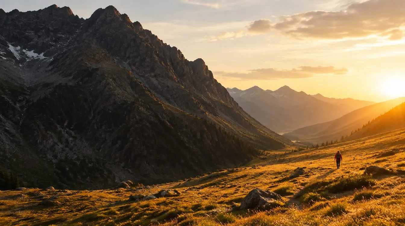
Mountain ranges, stretches of water, plains, groups of people and a subject moving across the frame are horizontal by nature. Adobe notes that horizontal emphasizes the expanse or tranquility of farmland, prairies and woodland. Fstoppers adds a useful detail: when the author wants to show vastness, they often crop even wider, to a 1:2 ratio, and a prominent foreground object then distracts from the view.
The cost of horizontal is the opposite one: if the subject is narrow and tall, you end up with two empty side strips. That happens more often than you would think, precisely because we shoot horizontal out of habit.
Is “landscape” always horizontal? What do the guides say?
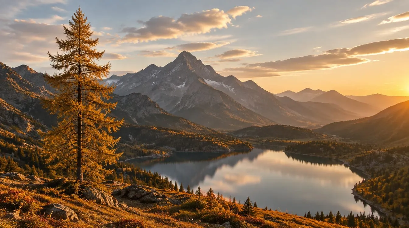
They disagree, and each is right for the scenes it has in mind. For a mountain range Adobe points to horizontal; Fstoppers and others argue that vertical is underused even in landscapes, because it often cleans up the picture and can follow a line such as a stream.
The practical conclusion: “landscape means horizontal” is not a rule, it is a statistic. The names themselves are a trap, as Fstoppers points out: calling horizontal “landscape” and vertical “portrait” pushes beginners to think that is the only way. A scene is made of elements, and each has a direction. Look at those, not at the genre label.
How do I choose in a few seconds? The four questions
Ask four questions in order: which way does the subject run, what is at the sides, what is above and below, and where will the photo be used. It takes ten seconds and works on any scene. They are a way to turn “it feels right” into a decision you can explain.
| Question | If the answer is… | Tends to win |
|---|---|---|
| 1. Which way do the subject and main lines run? | upward: trunk, waterfall, tower, climbing path | Vertical |
| sideways: ridge, shoreline, row of houses | Horizontal | |
| 2. What is at the sides? | nothing useful: flat sky, uniform grass | Vertical |
| context that explains or balances the subject | Horizontal | |
| 3. What is above and below? | a strong foreground below and something that matters above (sky, summit) | Vertical |
| little above and below: the story sits at mid-height | Horizontal | |
| 4. Where will the photo go? | phone screen, vertical cover | Vertical |
| computer screen, banner, horizontal print | Horizontal |
The first three questions are about the scene, the fourth is about use, and it should weigh less: the destination must not make the picture worse. If the scene is truly horizontal and you want it on a phone, shoot it horizontal and accept the bars.
Here is a typical case. A lone cypress on a hillside: a tall, narrow subject with nothing useful at the sides.
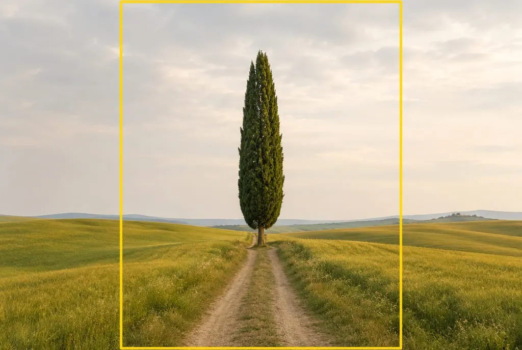 Image generated to illustrate the concept. In horizontal, the cypress takes up a narrow strip; the side bands outside the yellow rectangle are plain grass and sky.
Run the questions. Direction: the cypress is tall. Sides: empty. Above and below: the path leads the eye from the bottom up to the treetop. All three point to vertical. Here is the result.
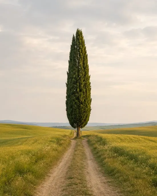 The same shot cropped to vertical 4:5. The path and the tree form a single line from bottom to top, and the empty side bands are gone.
Notice what changed: the subject takes up more of the frame because you removed what was diluting it. Vertical here is not a trend, it is a way to remove dead space.
Vertical at 2:3 or 4:5?
It depends on the scene and your taste; there is no universally right ratio. Full-frame and APS-C cameras shoot 3:2, so in vertical you get a tall, narrow image.
Fstoppers reports that some photographers find that vertical unnatural, and that this is why the author crops to the more compact 4:5. They state it as a personal preference, prompted by an e-book on aspect ratios by Bruce Percy, not as a rule. Take it as an invitation to experiment: crop some of your vertical shots to 4:5 and see whether the subject breathes better. If it does, leave a little air at the sides when you shoot.
What do I lose if I shoot horizontal and crop to vertical?
You lose pixels and, above all, compositional freedom. On a 3:2 sensor, a 4:5 vertical crop uses the full height but only about 53% of the width, so roughly half the pixels. With a 24-megapixel camera that leaves around 13 megapixels: plenty for a screen, less comfortable for a large print.
There is also a subtler problem: a photo composed for horizontal is not composed for vertical. The elements sit in the wrong places and the crop does not move them. A crop rescues a photo; it does not replace the choice at the moment you shoot. If you have time, shoot both orientations. Blind Magazine gives the same advice for anyone starting out.
What if the photo is for social media or a website?
The destination matters, but after the scene. Adobe suggests vertical for scrolling platforms and horizontal for a desktop banner, noting that the mobile version of the same site suits vertical better. The exact ratio each platform accepts changes over time, so check it when you publish.
A cheap habit: if you plan to publish, shoot a wide version and a vertical version of the same scene. You get two pictures that were composed on purpose, instead of one forced crop.
How does orientation connect to other composition choices?
Orientation changes how the other tools work. The rule of thirds applies in both formats, but after turning the camera, recheck where the intersection points fall; leading lines that rise from the bottom become a direct route for the eye. Vertical is also the format where a foreground in landscape photography pays off most, because there is room to layer the planes. If you choose horizontal and leave deliberate empty space at the sides, that is negative space and it needs a job. The big picture is in the guide to photography composition.
How does Framia evaluate it?
Orientation is not a criterion of its own: it falls under the composition criterion, which is about how well the arrangement of elements serves the subject. To see the difference on your own photos, upload the same scene in both orientations and compare the two explanations.
What to do next
An exercise for your next outing, or one you can do today with your archive:
- Pick five scenes. For each, shoot one horizontal and one vertical frame, even when the choice looks obvious.
- At home, look at the pairs as thumbnails, side by side. Before you think about it, mark which one you like more.
- Run the four questions (direction, sides, above and below, destination) on the scene and write down which format they pointed to.
- Compare: do your instinct and the questions agree? Where they don’t, ask what you were looking at. It is often an element that the sides or the height were hiding.
- Write one line per scene: “When shooting I should have…”. After five scenes you have your own personal rule.
If you want a second opinion, upload the two versions of the photo you are least sure about to Framia and read the composition criterion explanation.
FAQ
Should landscapes always be shot horizontally?
No. Guides disagree: some treat horizontal as the natural choice for a landscape, others argue vertical is underused. Let the scene decide. If the sides hold nothing interesting, or you have a strong foreground to connect to the background, vertical works. If you want to show vastness, stay horizontal.
Is vertical better for social media?
Often, because a vertical image fills more of a phone screen, and Adobe recommends vertical for scrolling platforms. But each platform accepts different ratios, and they change over time, so check before you decide. And don't give up a better composition just to fill the screen.
Can I shoot horizontal and crop to vertical later?
Yes, but you lose pixels: on a 3:2 sensor, a 4:5 vertical crop keeps about half the image. That is fine for screens and less so for large prints. If you think you might crop, leave some air around the subject when you shoot.
Which vertical ratio is better, 2:3 or 4:5?
There is no single answer. A 2:3 vertical is tall and narrow, and some photographers find it unnatural, which is why some crop to the more compact 4:5. It is a personal preference: try both on your own photos and see which gives the subject more room to breathe.
How do I train myself to think vertically?
For a few outings, shoot every scene in both orientations, even when you feel sure. Comparing them as thumbnails on a computer shows where the format helps and where it leaves dead space. After ten scenes your eye starts choosing on its own.