Photo Score: What It Means and How to Raise It
 by Marco Carotenuto · · 9 min read

You upload a photo you like and get a 62. If you grew up with letter grades, that reads like a D. It isn’t. Read properly, that number tells you something more useful: exactly where to put your effort on the next shot.
Search for “photo rating” and you’ll mostly find apps that score how attractive you look in a selfie. This article is about something else: scoring the photograph itself. You’ll learn what a photo score means, how it’s built from six criteria, why it’s sometimes lower than you expected, and how to raise it without chasing every detail. We use Framia’s scale as a concrete example, but the reasoning applies to any score with stated criteria.
What does a photo score actually mean?
It’s a summary: a number from 0 to 100 that says how well the shot works across six criteria, namely composition, light, optics, color, story and technique. It doesn’t measure how much you like the photo, or how good a photographer you are. It describes this image, as read by someone who doesn’t know where you were or what you were trying to say.
To be useful, a score needs anchors: fixed descriptions of what each band is worth. Without anchors, ratings tend to bunch up in the 75-85 range and stop telling photos apart. With anchors, a 64 today and a 64 six months from now mean the same thing, so you can use them to see whether you’re improving.
What is a good photo score?
It depends on the band, not the exact number. This is the scale Framia uses, with the labels you see in the app next to the score:
| Score | Label | What it tells you |
|---|---|---|
| 90-100 | Portfolio grade | Flawless execution and an original eye. Rare by design. |
| 80-89 | Strong shot | No flaw that matters, a clear idea. Publishable. |
| 70-79 | Good | The photo works; one or two fixable flaws remain. |
| 55-69 | Competent | The intent shows, but the execution has visible limits. This is the normal range for a good amateur shot. |
| 40-54 | Quick snapshot | The idea is there, but something gets in the way of how the image reads. |
| 25-39 | Worth reshooting | One serious error covers everything else: motion blur, missed focus, broken exposure. |
| 0-24 | Not this time | The shot can’t be rescued. |
So that 62 isn’t a fail: it’s the expected band for a good amateur shot, the one you grow from. The scale is strict on purpose. A technically correct photo with nothing remarkable about it scores 55-65, and when the scorer is torn between two values, it picks the lower one. If you want to apply the same yardstick to your own photos, the six criteria are explained one by one in how to tell if a photo is good.
How is the overall score calculated?
In Framia, the overall score is the rounded weighted average of the six category scores. The weights aren’t equal: composition and light count for a quarter each, half the total between them; color counts for 10%; the other three categories share the remaining 40%, between 10 and 15% each.
The practical consequence is easy to work out. If a photo’s light score goes from 52 to 64 (+12 points), the overall rises by 3 points (12 × 25%). The same jump in color adds just over 1 point (12 × 10%). For the same effort, improving the light moves the number more than twice as much.
Then there’s a rule a plain average wouldn’t have: the fatal flaw. If any single category drops below 30, the overall score can’t go above 55, even if the weighted average of the six would be higher. A photo with composition at 80, light at 78 and color at 75 but a blurred subject (technique 28) is capped at 55, because the blur is the first thing anyone sees. A flaw that kills the photo can’t be averaged away by the other five criteria.
Camera club judges break scores down by criteria too. In the Loveland Photographic Society’s online competitions, for example, each judge gives 5 to 9 points for impact, composition and technical quality, adds them up, and the final score is the average across judges. The club’s rules openly say that some judges value some areas more than others, and averaging across several judges smooths out those differences.
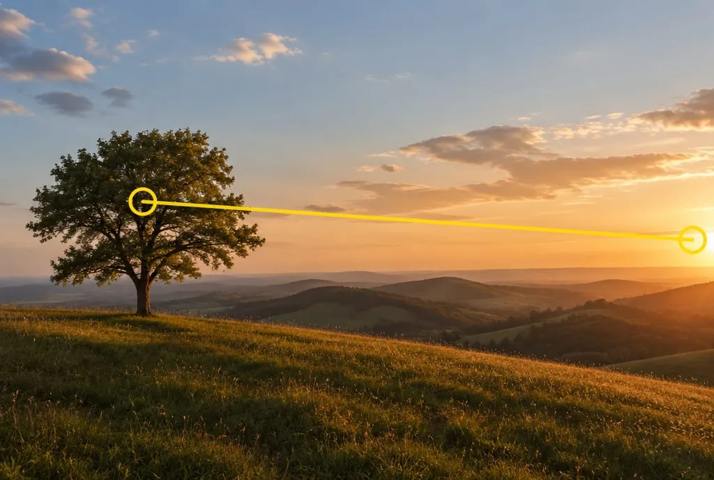 Composition and light make up half of the overall score. Here they work together: the tree on the left balances the low sun on the right, and the raking light brings out the texture of the grass. Image generated to illustrate the concept.
Why did my photo score low when I love it?
Because you know things the photo doesn’t show. You remember the cold, the climb, the person standing next to you; the viewer only sees the rectangle. The score reads what reaches a stranger, and the gap between “I love it” and “it works” usually sits right there.
When the number disappoints, the cause is usually one of three things:
- One very low criterion drags everything down. A blown-out sky or a tilted horizon costs more than you’d think, especially when it lands in light or composition.
- The photo is correct but ordinary. Good exposure and a sharp subject get you to 55-65, not further. To climb, you need a clear idea, light that shapes the scene, a reason to keep looking.
- The subject isn’t clear. If the eye doesn’t know where to rest, composition and story drop together.
There’s also the opposite case: you broke a rule on purpose, say a centered horizon for symmetry, and the feedback flags it as a flaw. Read the explanation. If the effect you were after is obvious in the photo, the choice holds up; if you’d have to explain it in words, it probably isn’t landing. For a criterion-by-criterion table of what AI analysis reads well and where it’s guessing, see AI photo analysis: what it sees and how reliable it is.
How much does a score need to rise to count as progress?
Enough to change the band, or to change which category is lowest. A one- or two-point difference between two analyses isn’t a signal: a score is an estimate, whether it comes from a model or a panel of judges. In the paper introducing NIMA, a Google Research model that predicts a photo’s aesthetic rating, the authors point out that the people in their reference dataset don’t agree with each other either: for roughly half the photos, the ratings have a standard deviation of more than 1.4 points out of 10.
So look at three things, in this order:
- Has the lowest category gone up? It’s the most stable and most useful piece of information.
- Has the band changed? Moving from “Competent” to “Good” means a visible flaw is gone.
- Has the number gone up consistently across several photos? A single +3 proves nothing; five photos in a row above your usual range do.
How do you raise a photo score?
Work on one category at a time: the lowest one, and when two are equally low, the one with the bigger weight. Improving everything at once is impossible to control and won’t tell you what worked. This table links the weakest criterion to the change to try on your next shot:
| Lowest category | Typical feedback | What to change on the next shot |
|---|---|---|
| Composition | Unclear subject, cluttered edges, horizon in the middle for no reason | Get closer, clean the edges by moving a step, decide whether the sky or the foreground gets the space |
| Light | Flat light or harsh overhead light, shadows hiding the subject | Come back at a different time or change your side relative to the sun, so the light arrives from the side and gives shape |
| Optics | Perspective that flattens or distorts, distracting background | Change focal length and distance to the subject, or the aperture, to blur the background or keep it readable |
| Color | Color cast, oversaturation, clashing colors | Fix the white balance, pull back saturation, look for a simpler palette |
| Story | “Nice place”, but no reason to look | Add something for scale, a gesture or a moment; ask what you want the viewer to understand |
| Technique | Motion blur, missed focus, blown highlights | Faster shutter speed (or a steady support, if the camera was what moved), focus point on the subject, exposure that protects the highlights |
If your lowest category is technique and the problem is blur, why are my photos blurry helps you tell camera shake from motion blur and fix each one. If you want a method for fixing one flaw at a time while you’re still on location, use the three-shot cycle in how to improve a photo.
Can editing raise a photo score?
Partly. Editing is good at rescuing color and some composition and light, but it can’t repair what never made it into the file:
- You can fix: color casts and saturation, contrast and exposure within the limits of the file, a tilted horizon, a crop that cleans the edges or moves the subject.
- You can’t fix: missed focus, motion blur, blown highlights (where the sensor recorded pure white there’s no detail to bring back), the direction of the light, a story that wasn’t in the scene.
Order matters too. A good crop can lift composition a few points, but if your lowest category is technique, no amount of color work will move it. Fix the weakest criterion first, then polish the rest.
What to do next
A 30-minute exercise to turn a score into a plan:
- Pick one of your photos that already has a score, ideally in the 55-69 band.
- Write down its lowest category and that category’s weight: 25% for composition or light, 10% for color, between 10 and 15% for the other three.
- Set a realistic target for that category, say +10 points, and work out how much the overall rises: 10 × 25% = 2.5 points for composition or light, about 1-1.5 points for the other categories.
- Choose one single change from the table above and write it in one sentence (“I’ll come back at 6 pm and stand with the sun to my side”).
- Reshoot, the same scene or a similar one, changing only that one thing.
- Have the new shot analyzed and compare: did the lowest category go up? Did the band change? If a different category is now the lowest, that’s your next target.
If you want to try it right away, upload the photo to Framia: a quick score costs 1 credit, full feedback across the six categories costs 2, and you get 4 when you sign up.
FAQ
What is a good score for an amateur photo?
On Framia's scale, a good amateur shot sits between 55 and 69: the intent is clear, but the execution has visible limits. From 70 the photo works with one or two fixable flaws, and from 80 it is a strong, publishable shot. A 90 is deliberately rare.
Why do two analyses of the same photo give slightly different numbers?
Because a score is an estimate, not a measurement, whether it comes from an AI model or from a panel of judges. A difference of one or two points tells you nothing. What matters is whether the band changes or the lowest category changes.
Does Framia rank my photo against other users' photos?
No. Each photo is scored against fixed band descriptions (for example "competent but ordinary" for 55-69), not against a leaderboard. That way a 64 is meant to mean the same thing today and six months from now, which is what lets you use it to track your progress.
Should I pick which photos to post by score alone?
Use it to cut weak frames and to see where to work, not as your only criterion. The number doesn't know your intent or the role a photo plays in a series: between two shots with similar scores, pick the one that says what you meant more clearly.